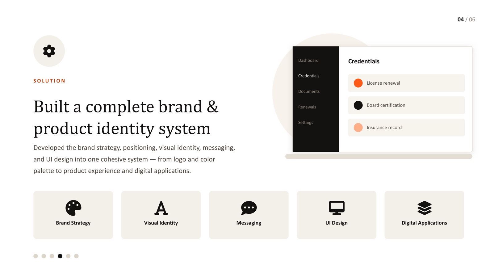
- Healthcare products carry unusually high stakes for inconsistency - a status label that means one thing on one screen and something else on another erodes trust fast.
- A real design system is documented patterns and reusable components, not just a shared colour palette.
- Accessibility should be a default property of your components, not a per-screen decision.
- The payoff is reusability across web, mobile and internal tools - not just visual consistency.
- A customer-facing design system, adopted across a real healthcare product team, is documented in our healthcare case study.
Most product teams start caring about design systems once inconsistency becomes visible enough to be embarrassing - three different button styles, two different date pickers, a status colour that means "good" on one screen and "warning" on another. In healthcare, that inconsistency isn't just an aesthetic problem. It's a trust problem, because the people using the product are often making decisions - about a credential, a patient record, a compliance step - based on what the interface tells them.
A real design system exists to prevent exactly this: not a shared colour palette, but a documented, reusable set of patterns that every team member can build from without reinventing the same decisions.
A component library isn't a design system
The distinction matters more than it sounds. A component library is a set of reusable UI pieces. A design system is the reasoning behind them - when to use which component, what each state means, how accessibility requirements are baked in, and how the whole thing evolves without breaking consistency. Teams that stop at the component library usually end up with the same problem they started with, just with prettier individual pieces.
Build accessibility into the defaults
This is where design systems and accessibility intersect directly. If your base button component meets contrast requirements and has a proper focus state, every screen built from it inherits that automatically - no individual designer has to remember to check. If accessibility lives outside the system, it has to be re-verified on every single screen, forever. Building it into the system's defaults is the only version of this that scales.
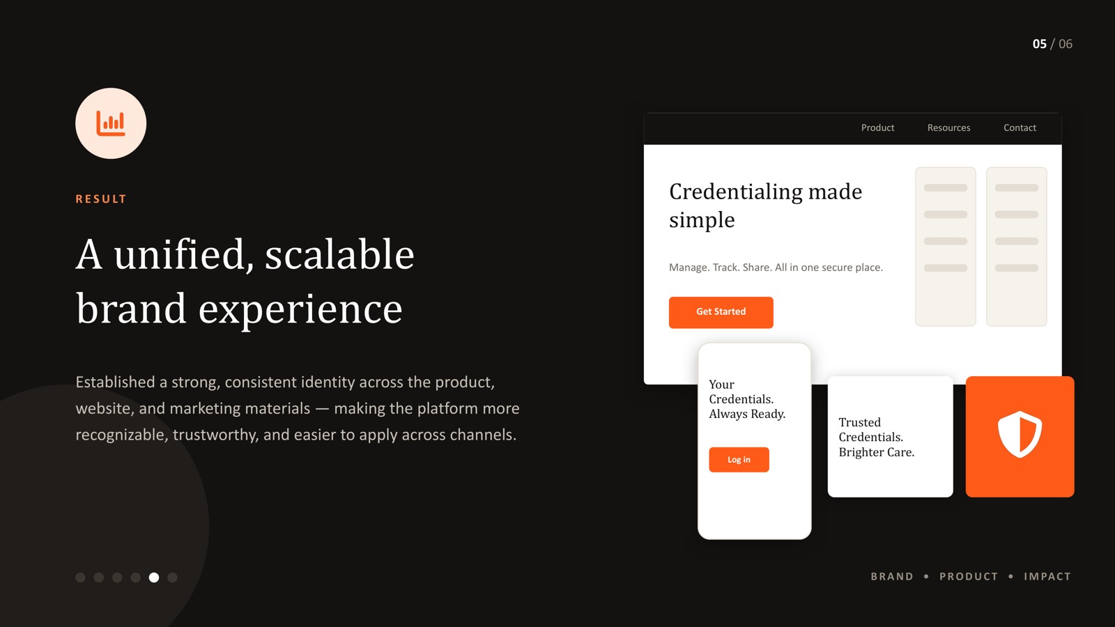
Documentation is what makes it actually work
The gap between "we have a design system" and "our product actually looks consistent" is almost always documentation. Without clear guidance on when to use which pattern and why, every new designer or engineer makes their own reasonable-sounding call, and those calls drift apart over time. Documenting not just the components but the decisions behind them is what keeps a growing healthcare product team - and a growing product surface, from web to mobile to internal ops tools - actually consistent instead of consistent in theory.
The healthcare product teams I've seen struggle with consistency almost never lack design talent - they lack a shared reference. Every designer is making good individual decisions; those decisions just aren't the same decisions, because there's nothing documented for them to align against.
I led adoption of a customer-facing design system on a healthcare product, and the improvement in reusability wasn't really about component count - it was about how much faster new screens could ship once the underlying decisions (states, accessibility, spacing) were already made and documented. That's the real ROI of a design system in this industry: not a prettier UI, but fewer inconsistent decisions compounding into user distrust.
Where to start
If your product has grown past the point where "just check the last screen" is a viable consistency strategy, the practical starting point is usually a small, well-documented core - buttons, forms, status patterns, accessibility defaults - built once and reused everywhere. This is exactly the approach behind our healthcare credentialing platform case study. For teams operating in regulated healthcare and BFSI-adjacent markets like Mumbai or the life sciences corridor around Hyderabad, a documented system also makes compliance and procurement reviews considerably easier to pass.
Product inconsistency slowing your team down?
Let's talk about what a real design system - not just a component library - would look like for your product.