Product managers, designers and operations leads building or improving provider credentialing, enrolment and verification software.
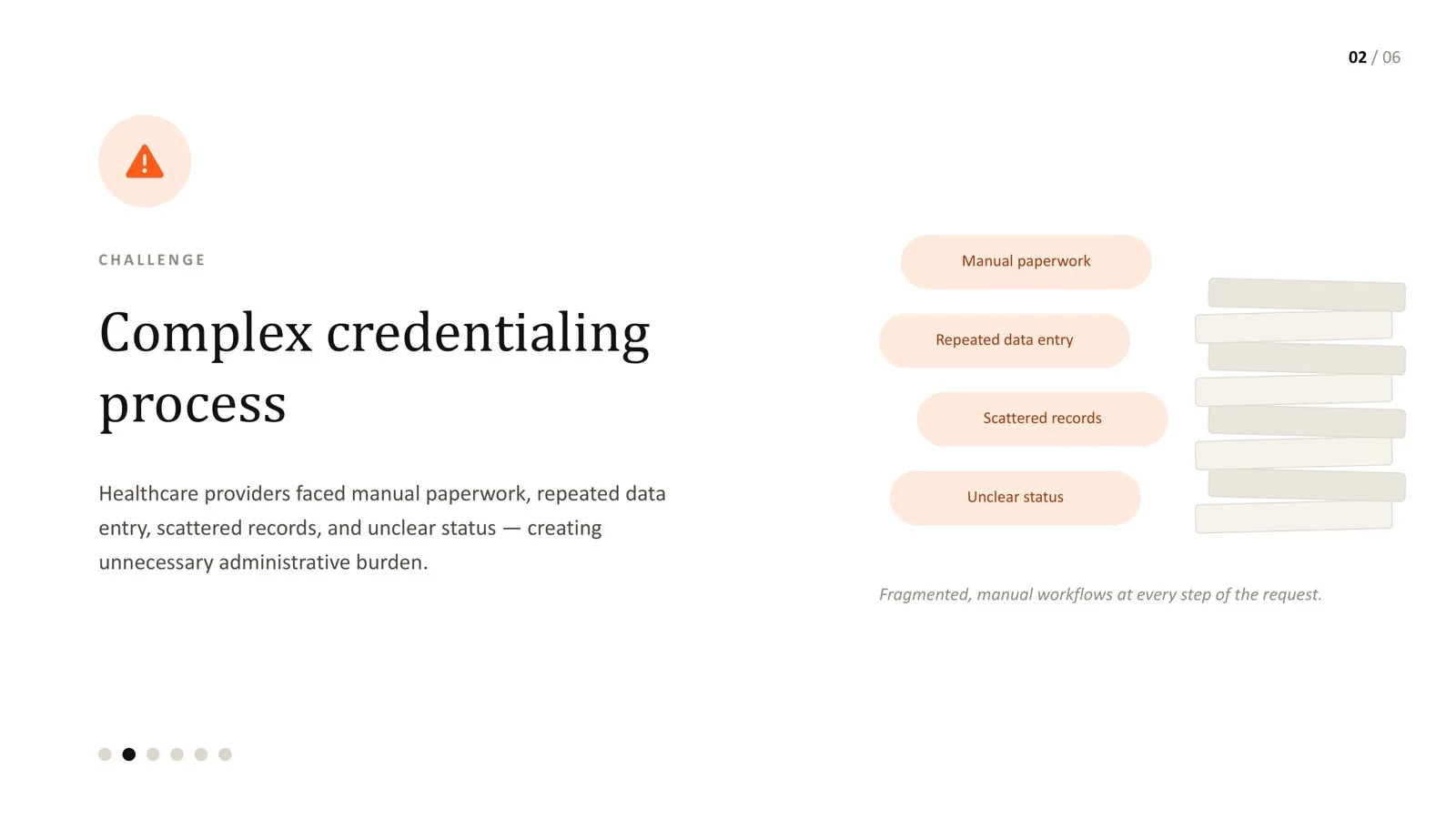
- Credentialing UX usually fails in three compounding ways: manual paperwork that should be structured data, repeated data entry, and unclear status.
- Fix the data model before the screens. A single source of truth for provider information removes more friction than any visual redesign.
- Treat status as a first-class design pattern: consistent labels, colours and icons, plus an explicit "what happens next" and who owns it.
- Design the whole journey - provider, coordinator and reviewer - with shared patterns, not a stack of separate forms.
- The stakes are real: in a November 2025 MGMA poll, about a third of medical groups reported credentialing backlogs or delays.
Ask anyone who has renewed a professional credential how the process felt, and "smooth" is rarely the word they choose. Credentialing workflows accumulate complexity over time - a form here, a manual review step there, a new document requirement from one payer - until providers and administrators spend more effort managing the process than the credential itself requires.
The UX problem is almost never one bad screen. It is three issues that compound: paperwork that could be structured data, the same information typed in again and again, and status that leaves everyone unsure what happens next. This article covers how to design around all three.
Why credentialing UX matters to the business
Credentialing delays are not only frustrating; they hold up when a clinician can start seeing patients and when an organisation can bill for their work. A November 2025 MGMA Stat poll of 131 medical group leaders found that 65% said new-hire credentialing, recredentialing and reappointment files were on time - which means roughly a third were not, with 23% reporting a backlog.
Source: MGMA Stat, November 4, 2025
View as table
| Status | Share of groups |
|---|---|
| On time | 65% |
| Backlog | 23% |
| Will slip into next quarter | 6% |
| Credentials verification organisation (CVO) delay | 3% |
| Other | 3% |
The wider administrative picture points the same way. The 2025 CAQH Index estimated that US healthcare still has a $21 billion savings opportunity from fully automating manual and partially manual administrative transactions. Not all of that is credentialing, but credentialing is a textbook example of work that is still manual because the software around it makes structure hard.
Problem 1: Paperwork that should be data
Many credentialing tools digitise paper rather than redesign the process. The provider uploads a scanned licence; a coordinator reads the expiry date off the PDF and types it into a field; someone else sets a reminder in a spreadsheet. The document exists in the system, but the information inside it does not.
Better patterns:
- Capture structured fields first, documents second. Ask for the licence number, issuing state and expiry date as data, then attach the document as evidence.
- Pre-fill from trusted sources where possible. If a value can be verified from a primary source or an existing profile, show it for confirmation rather than asking the user to type it.
- Validate at entry. Catch format errors and expired dates immediately, not days later in review.
- Keep document requirements visible. Show exactly which documents are required for this provider type and this payer, and which are already on file.
Problem 2: Repeated data entry
If a provider types their licence number into three different forms, no amount of visual polish fixes the experience. The fix sits in the information architecture: one provider profile that every workflow reads from and writes back to.
This is where UX and engineering decisions must happen together. Before designing screens, map every piece of information the workflows need and answer three questions for each:
| Question | Why it matters |
|---|---|
| Where is this value first captured? | Defines the single source of truth |
| Which later steps need it? | Those steps should read it, never ask for it again |
| Who can change it, and what re-verification does a change trigger? | Prevents silent inconsistencies and keeps the audit trail honest |
Doing this mapping up front is unglamorous. It is also the step that saves a redesign six months later.
Problem 3: Unclear status
"Active", "Verified", "Pending", "Expiring" - these words carry real weight in credentialing. When status is treated as an incidental label, people stop trusting it and start double-checking manually, which defeats the point of the system. Support tickets that ask "where is my application?" are almost always a status-design problem.
Treat status as a first-class pattern with five parts, defined once and used everywhere:
| Status | What it means | What happens next | Who acts | Plain-language copy example |
|---|---|---|---|---|
| Draft | Application started, not submitted | Provider completes missing items | Provider | "3 items left before you can submit." |
| Submitted | All required items received | Primary-source verification begins | Coordinator | "Received on 12 May. Verification usually starts within 2 working days." |
| In verification | Documents being checked with issuing bodies | Reviewer confirms or requests information | Reviewer | "We're checking your licence with the state board." |
| Action needed | Something is missing or unclear | Provider responds to a specific request | Provider | "Upload a clearer copy of your DEA certificate." |
| Verified / Active | Credential confirmed and in force | Monitoring until renewal window | System | "Verified on 20 May. Renewal due March 2027." |
| Expiring | Within the renewal window | Provider uploads renewal | Provider | "Expires in 30 days - upload your renewal to stay active." |
Rules that make the pattern work:
- The same status uses the same label, colour and icon everywhere - dashboards, detail pages, emails and exports.
- Never rely on colour alone; always pair it with text and an icon so the status is readable by everyone and in print.
- Every non-final status shows the next step and who owns it.
- Avoid vague intermediate states. "Processing" without a timeframe or owner generates support tickets.
- Show when the status last changed, so people can judge whether something is stuck.
Design the whole journey, not just the request form
Credentialing connects providers, coordinators, reviewers, and often external verification sources. Designing each role's screens as separate projects is how inconsistency creeps in. The workflows that genuinely reduce administrative burden share patterns across roles:
- Provider view: a checklist-style profile showing what is complete, what is missing and what is expiring, with one clear next action.
- Coordinator view: a queue sorted by what needs attention, with filters by status, due date and payer, and bulk actions for routine steps.
- Reviewer view: evidence and extracted data side by side, with a clear approve, reject or request-information decision and a reason field that feeds the audit trail.
- Notifications: reminders tied to real dates and statuses, written in the same language as the product.
This is the same principle behind design systems for healthcare product teams: consistency compounds across surfaces.
Remember who is using it and when
Clinicians already carry a heavy administrative load. A time-and-motion study of 57 US physicians published in Annals of Internal Medicine found that, during the office day, they spent 27.0% of their time on direct clinical face time and 49.2% on EHR and desk work - nearly two hours of screen and desk work for every hour with patients. Credentialing tasks land on top of that. Design for short sessions on mobile, clear save-and-return, and reminders that respect people's time.
Accessibility matters here too: providers and coordinators include people with low vision, motor impairments and other disabilities. Build contrast, keyboard access and clear error messages into the components from the start - see our practical WCAG guide for healthcare software.
Measuring whether the redesign worked
Pick a small set of measures before you start, so success is not judged on looks:
- Time from application start to submission, and from submission to verified.
- Percentage of applications returned for missing or incorrect information.
- Number of "where is my request" support contacts per 100 applications.
- Fields entered more than once per application (target: zero).
- Coordinator time per file, and the size of the backlog over time.
Every credentialing platform I have worked on had the same root cause behind its worst UX: the process had been designed one form at a time, by whoever needed the next field, rather than mapped end to end. Nobody set out to build something confusing - it accumulated.
On the healthcare credentialing platform, the fix was not a dramatic feature. It was going back to first principles: one source of truth, a real status pattern, and workflows designed as one connected journey instead of a stack of independent forms. That is rarely the flashy part of a redesign, but it is almost always the part that reduces the administrative burden users came to complain about.
Frequently asked questions
Should we automate credentialing before redesigning the UX?
Map the data and status model first. Automation built on top of a fragmented model tends to automate the confusion. A clear single source of truth makes automation easier and safer.
How many statuses should a credentialing workflow have?
As few as can honestly describe what is happening - usually five to seven. Each one must have a clear meaning, a next step and an owner. If two statuses lead to the same next step, consider merging them.
How do we reduce repeated data entry across payers?
Store provider data once in a structured profile and generate payer-specific applications from it. Ask only for the genuinely new information each payer requires.
What is the quickest win in a credentialing redesign?
Usually status clarity: consistent labels, a visible next step and an owner for every non-final state. It reduces support contacts quickly and needs relatively little engineering.
Do providers really use credentialing tools on mobile?
Many do, especially for uploads and reminders between clinical sessions. Design at least the provider checklist, upload and status views to work well on a phone.
Credentialing workflow causing support tickets?
Let's map where the friction actually is before redesigning anything.
Sources
Every statistic in this article links to its original publisher. Figures were checked against these sources on September 29, 2026.
- Confronting credentialing, reappointment crunch time in your medical practice - MGMA Stat, November 2025
- 2025 CAQH Index shows U.S. healthcare avoided $258 billion - CAQH (DataSpring), February 2026
- Allocation of Physician Time in Ambulatory Practice - Sinsky et al., Annals of Internal Medicine, 2016