
Marketing heads, business-development leaders and leadership teams at infrastructure, EPC, engineering and industrial companies whose brand no longer reflects the track record they have earned.
- Infrastructure and industrial buyers judge credibility through consistency and discipline, not visual boldness.
- A logo refresh without a system behind it becomes next year's inconsistency. The system - rules for logo, colour, type, grid and application - is the real deliverable.
- The identity should read as infrastructure, not as a tech startup. Borrowed consumer-tech cues can undercut trust with procurement and engineering evaluators.
- Brand work in this sector is mostly about proposals, tenders, decks, site documentation and the website - so templates matter as much as the logo.
- A real example: an infrastructure brand system with enforceable rules such as 160px/120px minimum logo sizes, a 12/8/4 grid and a 4-64px spacing scale.
Infrastructure and industrial companies have a brand problem that consumer companies rarely face. The people evaluating them are slow-moving, risk-averse and professionally sceptical. They are choosing a partner for a contract that may run for years, and they are looking for evidence that the company is disciplined, reliable and able to deliver at scale. A brand that leans too hard into contemporary startup visual language can work against that, not for it.
The goal is not a quieter brand for its own sake. It is a brand built to earn trust from the people who actually make infrastructure decisions: enterprise and government procurement, engineering leadership, consultants and long-term partners.
How infrastructure buyers read a brand
Three features of this market shape what a brand needs to do.
Most buyers are not buying today. Research from the Ehrenberg-Bass Institute with the LinkedIn B2B Institute - the source of the "95-5 rule" - suggests that at any given moment around 95% of potential B2B buyers are out of the market. For infrastructure, where contracts come up rarely, that proportion is likely higher. The brand's job is to be remembered as credible when a need does arise, not to generate a click this week.
Decisions are made by groups, with procurement involved early. Forrester found procurement professionals are decision-makers in 53% of business buying cycles. Procurement reads documents side by side: your proposal, your capability statement, your website, your competitor's tender. Inconsistency between them is noticed.
Visual impressions are formed fast and shape credibility. In Stanford's large credibility study, the "design look" of a site was the most frequently cited factor in people's credibility judgements, mentioned in 46.1% of comments. In a market built on reliability, a disordered visual presence contradicts the claim being made.
Authority comes from consistency, not decoration
When a brand feels dated, the instinct is often to add: more colour, more gradients, bolder illustration, a louder tagline. For infrastructure audiences that instinct tends to backfire. What reads as credible is the same logo usage, the same colour discipline and the same tone across a tender document, a website and a site hoarding. Discipline is the signal.
| Signal | Consumer-tech cue that can backfire | Infrastructure-appropriate alternative |
|---|---|---|
| Colour | Saturated gradients, many accent colours | A restrained palette with one confident accent used for emphasis only |
| Typography | Quirky display faces, very tight headline spacing | Robust, highly legible families that work in technical documents and tables |
| Imagery | Staged stock photos, abstract 3D shapes | Real projects, real sites, real people; engineering drawings used honestly |
| Illustration | Playful characters and mascots | Diagrams, maps and data that explain scope and capability |
| Tone | Excited, informal, superlative-heavy | Precise, calm, evidence-led - scale, safety record, delivery history |
| Motion | Bouncy micro-interactions everywhere | Minimal, purposeful motion that supports reading |
None of this means the brand has to be dull. The craft moves into precision: well-set typography, strong photography of real work, and layouts that make complex capability easy to understand.
A logo is not a system
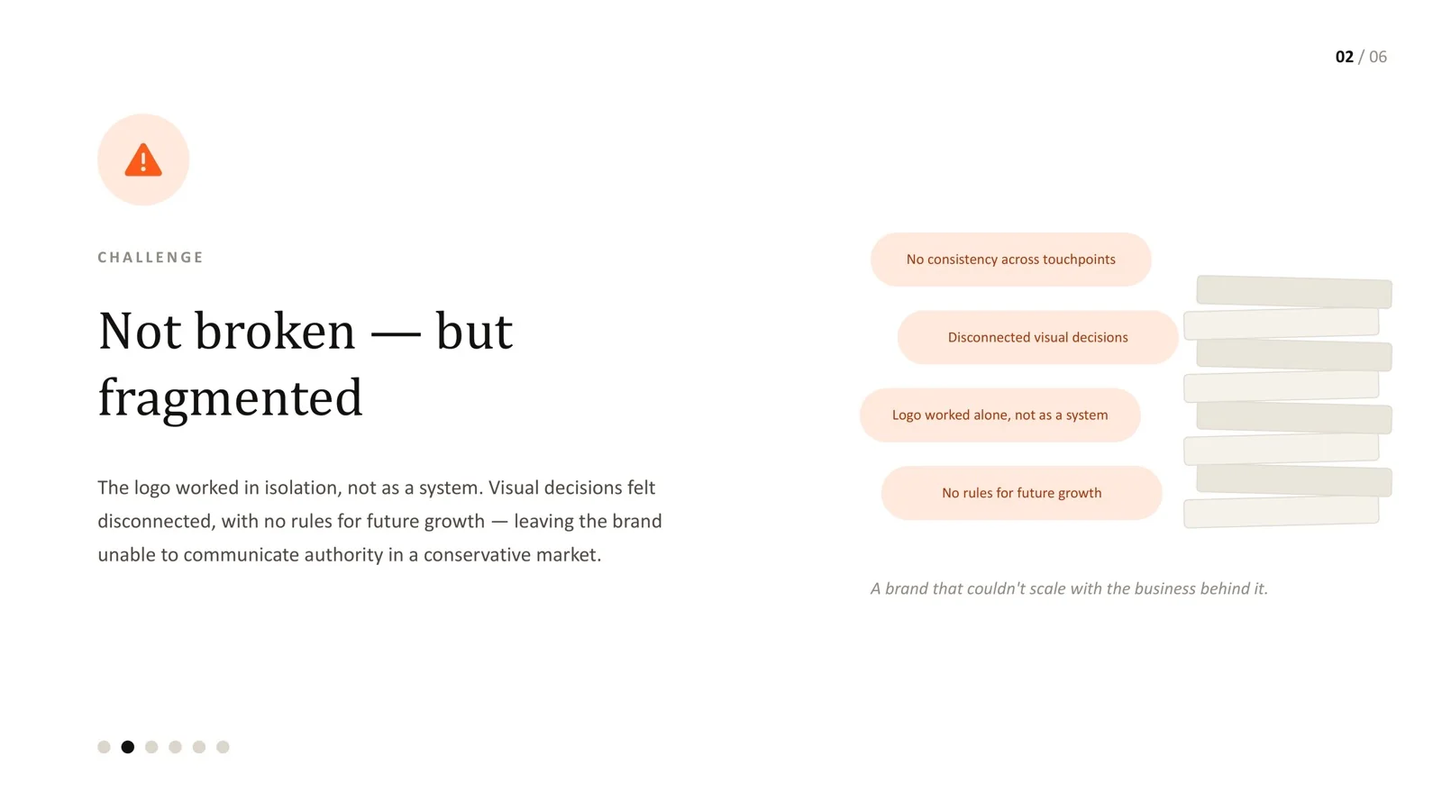
The most common failure I see is not a bad logo. It is a logo with no system behind it: no rules for how it scales, which colour combinations are approved, how it sits alongside partner and client logos, or how new applications should be judged. Every new use becomes a one-off decision, and small inconsistencies accumulate until proposals, decks and the website look like they came from different companies.
On an infrastructure brand system project, the brief was not a "modern" identity. It was a structured, industry-aligned one that communicated authority through consistency and could expand across platforms and teams. That meant writing rules specific enough to check:
| Rule | Specification | Why it matters |
|---|---|---|
| Minimum logo size | 160px desktop / 120px mobile | Below this the mark loses legibility, so it does not ship |
| Symbol-only threshold | 24px / 32px | Favicons and small UI indicators switch to the symbol alone |
| Grid | 12 / 8 / 4 columns (desktop / tablet / mobile) | Every layout, from web pages to report covers, shares one structure |
| Spacing scale | 4-64px in fixed increments | No arbitrary values, so layouts stay consistent across authors |
Each of these has a clear pass or fail answer. "Use the logo appropriately" does not. For more on writing rules like these, see how to build an enforceable design system.
Where infrastructure brands actually live
For an infrastructure company, the website is often not where most brand impressions happen. The brand is judged in:
- Tenders, proposals and capability statements - usually assembled under deadline by business-development teams.
- Pitch and project decks - edited by many people across regions and business units.
- Project reports and client documentation - the material that proves delivery.
- Site signage, vehicles, uniforms and safety material - highly visible, long-lived and expensive to change.
- The website and LinkedIn - where new buyers and recruits check you out.
This is why templates matter as much as the identity itself. If the proposal template is hard to use, people will copy an old one and the new brand will never reach the documents that win contracts. A useful rollout plan starts with the highest-volume, highest-stakes documents rather than the logo reveal.
A practical build sequence
- Discovery and alignment. Interview leadership, business development and a few clients. Audit current material across proposals, decks, site and signage. Benchmark competitors and adjacent sectors.
- Positioning. Agree in writing what the brand must communicate - for example scale, safety, engineering depth, reliability - and the evidence that supports each claim.
- Identity system. Logo system and rules, a functional colour palette with defined roles, a type system that works in long documents and tables, a grid and spacing scale, photography direction.
- Templates. Proposal, capability statement, report, presentation, email signature, social - built and tested with the people who will use them.
- Documentation and governance. A practical guideline with pass/fail rules, a file library, and a named owner who approves new applications.
- Digital application. Website and digital tools updated to match, so the online first impression reflects the same discipline. See our notes on UX for enterprise applications in conservative industries.
Mistakes to avoid
- Launching with a logo reveal and no templates. The old proposals keep circulating for years.
- Copying the visual language of software startups. It can suggest the company is younger or less proven than it is.
- Using stock imagery instead of real projects. Your completed work is the most credible visual asset you have.
- Writing guidelines nobody can check. "Maintain a premium feel" settles nothing; "minimum logo size 160px" does.
- No owner after launch. Multi-business-unit companies fragment fastest without governance.
The infrastructure and industrial brands I have worked with rarely need to look more exciting. They need to look more inevitable - as if the company has been doing this reliably for a long time and will keep doing it.
That is a harder brief than a flashy rebrand, because restraint is easy to get wrong in either direction: too little discipline looks careless, too much looks stale. The system - specific rules, good templates and an owner - is what keeps it calibrated as the brand spreads across proposals, sites and teams.
Frequently asked questions
Should an infrastructure company's brand feel modern?
It should feel current and well-crafted, but not borrowed from consumer technology. Modernity in this sector comes from clarity, good typography and real project imagery rather than trend-driven effects.
What should a brand refresh cost relative to a full rebrand?
Costs vary widely with scope. A refresh that keeps the existing mark and adds a proper system and templates is usually far less disruptive than a new name or symbol, and often delivers most of the consistency benefit.
How do we get business-development teams to use the new templates?
Build the templates with them, make them faster to use than the old ones, and retire the old files from shared drives. Adoption is a usability problem as much as a policy one.
How do we handle joint-venture and partner logos?
Define lockup rules for co-branding - clear space, relative sizing and order - in the guidelines, with examples for the most common partnership types.
Does the website need to be redesigned at the same time?
Not necessarily at the same moment, but the website should not contradict the new identity for long. Many teams update key templates and high-traffic pages first, then the rest.
Brand not reflecting your company's real authority?
Let's build a structured identity system your team can apply consistently.
Sources
Every statistic in this article links to its original publisher. Figures were checked against these sources on September 29, 2026.
- The 95-5 Rule - LinkedIn B2B Institute with the Ehrenberg-Bass Institute
- The State Of Business Buying, 2026 - Forrester, 2026
- How Do People Evaluate a Web Site's Credibility? - Fogg et al., Stanford / Consumer WebWatch, 2002