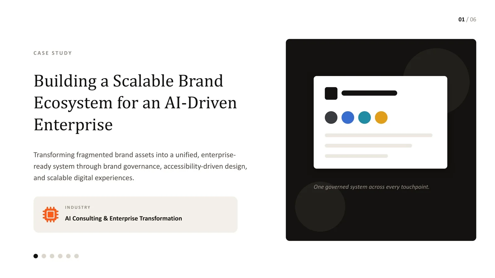
Brand managers, design leads and marketing teams whose brand guidelines exist on paper but are applied inconsistently across teams, agencies and business units.
- A style guide describes preferences. An enforceable design system sets rules a team can be checked against - each one with a clear pass or fail answer.
- Real examples from an infrastructure brand system: 160px/120px minimum logo sizes, a 24px/32px symbol-only threshold, a 12/8/4 column grid and a 4-64px spacing scale with no arbitrary values.
- Enforceability comes from four things: measurable rules, templates and components that make the right choice the easy one, checks, and an owner.
- Build rules after discovery, not before. Rules must come from what the brand actually needs to do.
- Quick test: could a new team member apply five of your rules without asking a follow-up question?
Many "design systems" are style guides with a more ambitious name: a PDF or a Figma file describing preferred colours, fonts and a logo lockup, with enough room for interpretation that two people following it correctly still produce visibly different results. That ambiguity is the whole problem.
A style guide says what the brand should generally look like. An enforceable design system sets rules specific enough to check - and gives people the templates, components and tools that make following them the path of least resistance.
Style guide vs enforceable design system
| Style guide | Enforceable design system | |
|---|---|---|
| Language | Descriptive: "use generous spacing" | Prescriptive: "spacing uses 4, 8, 12, 16, 24, 32, 48, 64px only" |
| Answer to "does this pass?" | Depends who you ask | Yes or no, measurable |
| Format | PDF or slide deck | Documentation plus templates, components and tokens |
| Where it lives | A shared drive | In the tools people already use: Figma libraries, code, document templates |
| Who keeps it current | Whoever wrote it, once | A named owner with a change process |
| What happens when rules are broken | Nothing, usually | It is caught in templates, review or automated checks |
The shift is not about writing more pages. Most inconsistent brands I inherit have plenty of documentation. The problem is that it describes rather than decides.
What "enforceable" looks like in practice
On an infrastructure brand system, the brief was to communicate authority through consistency across proposals, decks, the website and site material. That meant rules that could be measured:
| Rule | Specification | How it is checked |
|---|---|---|
| Minimum logo size | 160px on desktop, 120px on mobile | Measure the rendered width; below the minimum, the mark does not ship |
| Symbol-only threshold | 24px / 32px | Favicons and small UI indicators use the symbol alone below this size |
| Grid | 12 columns desktop, 8 tablet, 4 mobile | Layouts built on the shared grid in design files and templates |
| Spacing | 4-64px scale, fixed increments | Values outside the scale are flagged in review; tokens make them hard to use in code |
Every one of these has one answer. "Use the logo appropriately" does not. That difference is what lets a designer, engineer or agency apply the brand without a meeting.
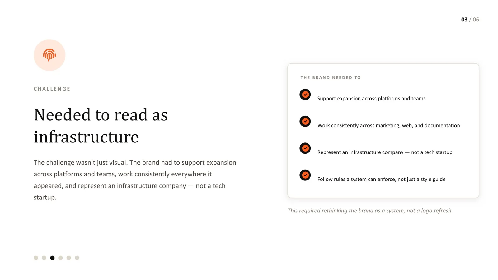
The six building blocks
An enforceable system is built by first understanding what the brand needs to do, then codifying it. On the infrastructure project the work ran in six phases:
- Discovery and alignment - what the brand needs to achieve and for whom, agreed before any design.
- Logo system - the mark, its lockups, and measurable usage rules.
- Colour system - a functional palette where each colour has a defined role, not just a swatch list, with tested contrast values for text pairings.
- Typography - a type scale with real hierarchy rules for headings, body, captions and tables.
- Grid and spacing - the structural rules that keep every layout consistent.
- Documentation - the reference that makes all of the above usable day to day.
Doing discovery first matters. Rules written before anyone understands the real use cases tend to be either too loose to help or so strict that people ignore them.
Four things that make rules stick
1. Measurable rules. If a rule cannot be checked, it is advice. Convert each guideline into a number, a list or a yes/no condition.
2. Templates and components. People follow the easiest path. If the proposal template already uses the right grid, type and logo placement, most documents will be right without anyone reading the guidelines. In product and web work, library components and design tokens do the same job. Figma's research found designers with a design system completed a task 34% faster - the enforcement and the speed come from the same place.
3. Checks. Build checking into existing workflows rather than adding a separate approval step:
- A short checklist attached to templates ("logo at least 160px, spacing on the scale, approved colour pairings only").
- Design review that references rules by name, not by taste.
- Code linting that flags hard-coded colours and spacing values.
- Accessibility checks for colour contrast against WCAG 2.1 thresholds.
4. An owner and a change process. Rules will need to change. Name who approves changes, publish a changelog, and give people a way to request new patterns. Without an owner, the system freezes or fragments.
Writing a good rule
A useful format for every rule:
- Rule: what must be true, stated measurably.
- Why: one sentence on the reason, so people respect it rather than route around it.
- Example: a correct and an incorrect use.
- Exception process: who can approve a deviation, if anyone.
For example: Rule: body text meets 4.5:1 contrast against its background. Why: smaller text becomes hard to read for many people below this ratio. Example: grey #6b6b6b on white passes; light grey #a0a0a0 on white does not. Exceptions: none for body text.
The five-rule test
Pick five rules from your current guidelines at random. For each, ask: could a new team member or an outside agency apply this correctly without asking a follow-up question?
- If four or five pass, you have an enforceable system that may just need better templates.
- If two or three pass, rewrite the vague rules as measurable ones.
- If none pass, you have a style guide. Start with discovery, then rebuild the rules.
Where teams go wrong
- Too many rules. A 120-page guideline that tries to govern every edge case goes unread. Cover the decisions that happen daily.
- Rules without tools. Measurable rules still fail if the templates and components ignore them.
- No exceptions process. When legitimate edge cases have no route, people quietly break rules and the system loses authority.
- Rules frozen at launch. Brands evolve; the system needs versioning and a changelog.
Almost every brand system I have inherited that was not working had plenty of documentation. The problem was never a lack of pages. The guidance was descriptive rather than enforceable, full of phrases like "use good judgement" that sound reasonable and settle nothing.
The infrastructure brand system deliberately erred toward specificity - real pixel values, real ratios, real thresholds. It felt restrictive to describe up front, but in practice it gave the team faster, more confident decisions because there was finally a clear answer to "does this pass". That is the test of whether a design system is enforceable or just aspirational.
Frequently asked questions
Is a design system only for digital products?
No. The same principles apply to proposals, presentations, reports and signage. For many B2B and infrastructure companies, documents are where the brand is seen most.
Won't strict rules make everything look the same?
Consistency in structure leaves plenty of room for variety in content, imagery and emphasis. The rules remove low-value decisions so people can spend effort where it matters.
How many rules should a system have?
Enough to cover the decisions people make every week - logo, colour roles, type scale, grid, spacing, imagery, key components - usually a few dozen measurable rules, backed by templates.
How do we enforce rules with external agencies?
Give them the same templates, component libraries and checklist, and review work against named rules. Make compliance part of the brief and acceptance criteria.
Can we convert an existing style guide instead of starting again?
Often, yes. Keep what works, rewrite vague guidance as measurable rules, add templates and tokens, and assign an owner. Start again only if the underlying identity no longer fits the business.
Have a style guide nobody applies consistently?
Let's turn it into rules your team can actually be held to.
Sources
Every statistic in this article links to its original publisher. Figures were checked against these sources on September 29, 2026.