Designed for the places identities actually break
Most identity guidelines are written for the marketing site and a few hero images. Identities actually break in the places guidelines skip:
| Where | What goes wrong | What the system defines |
|---|
| Product UI | Brand colours used for status, clashing with meaning | Separate, tested status colours; accent reserved for actions |
|---|
| Dense tables and dashboards | Display typefaces unreadable at small sizes | A type scale tested at 12-14px and in tables |
|---|
| Proposals and reports | Logo stretched, colours approximated in Word | Document templates with locked styles |
|---|
| Small sizes | Detailed logos illegible as favicons | A symbol-only version below a defined size |
|---|
| Dark backgrounds | Contrast collapses | Tested colourways for light and dark surfaces |
|---|
| Partner lockups | Unequal sizing, crowding | Co-branding rules with examples |
|---|
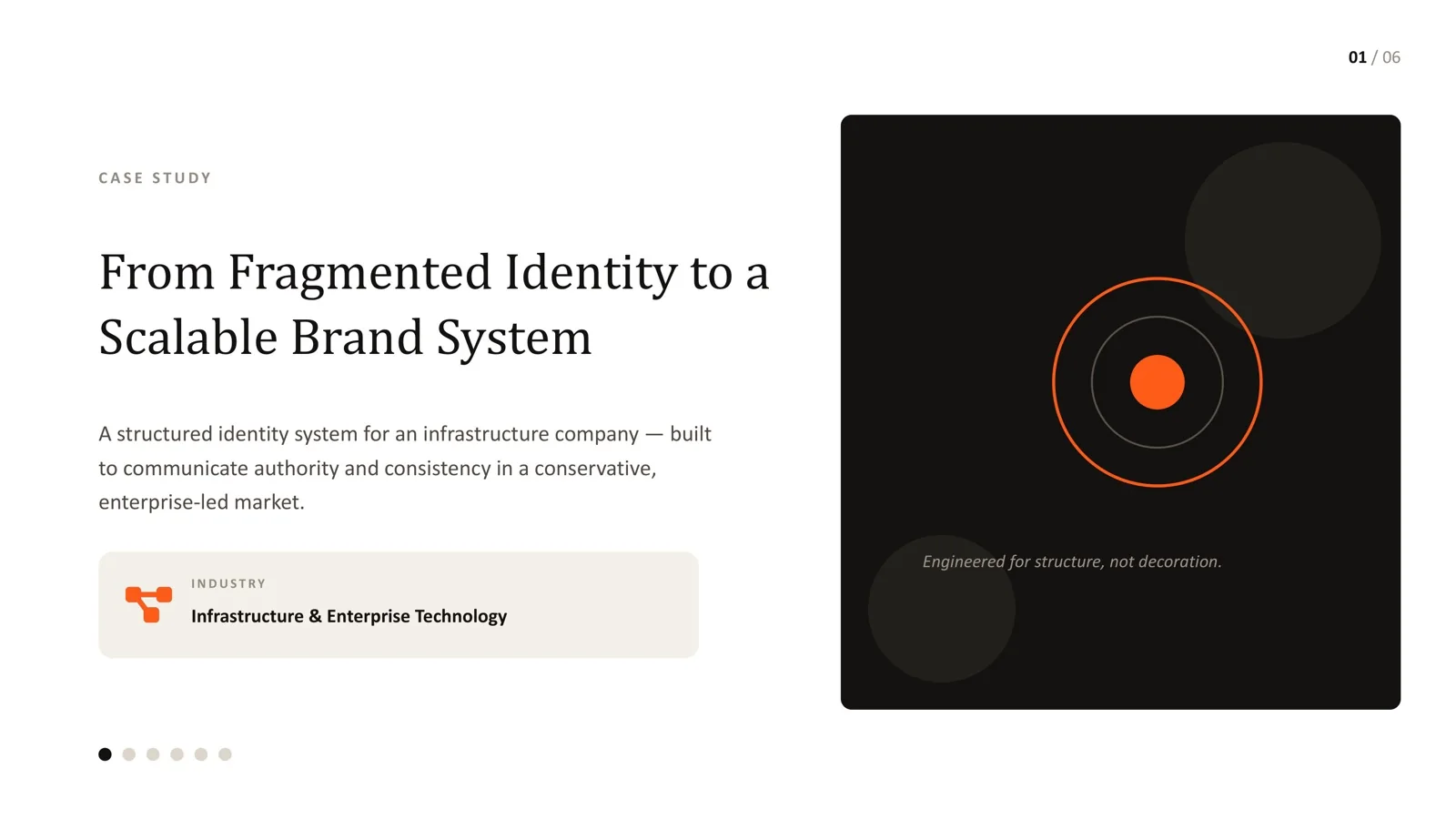
On an infrastructure brand system, this meant measurable rules: a minimum logo size of 160px on desktop and 120px on mobile, a symbol-only threshold at 24px and 32px, a 12/8/4 column grid and a 4-64px spacing scale. Each has a clear pass or fail answer.
Accessibility is part of the identity
Colour choices affect whether people can read your brand. WebAIM's 2026 analysis of the top one million home pages found low-contrast text on 83.9% of them - the single most common accessibility failure on the web, and one that starts in identity decisions.
Every text-and-background pairing in the systems I design is tested against WCAG 2.1 contrast requirements - 4.5:1 for normal text, 3:1 for large text - before the palette is approved. On an AI brand project, that testing caught an accent pairing already in use at 2.37:1; the rebuilt system's primary pairing measured 17.26:1. Bright brand colours can still be used boldly for large display elements and backgrounds; they just are not used for small text where they fail.