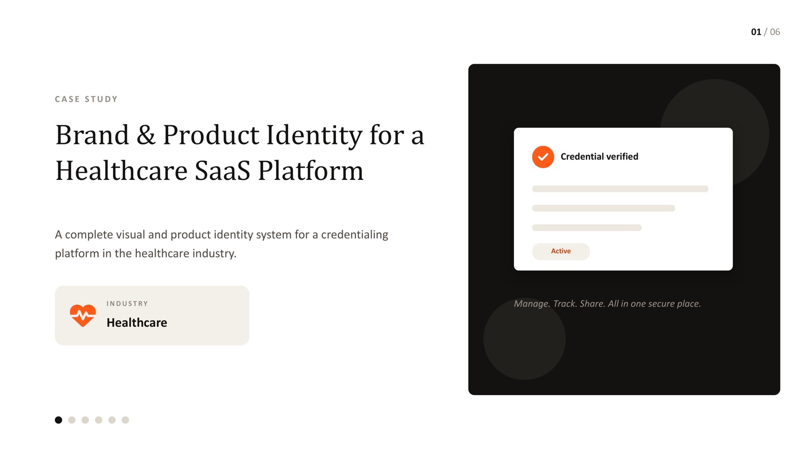
- Healthcare buyers judge credibility before they judge features - brand and product UI need to be built as one system, not two separate projects.
- Start with positioning and messaging before any visual work - what the platform needs to communicate should drive the identity, not the other way round.
- The identity has to survive contact with the actual product: credential states, dashboards and status labels, not just the marketing site.
- Accessibility (WCAG A/AA/AAA) belongs in the brand system from day one - it's a trust signal in healthcare, not a compliance afterthought.
- A real example: a complete brand and product identity system built for a healthcare credentialing platform, covered in depth in our healthcare case study.
Most healthcare software gets its brand and its product designed by two different processes that never quite talk to each other. Marketing ships a polished identity. Product ships whatever the roadmap allows. The result is a platform that looks trustworthy on the homepage and confusing the moment someone logs in - which is exactly the wrong place to lose trust in a healthcare context.
The fix isn't a bigger design team. It's treating brand and product as one system from the start, built around the same positioning, the same visual language and the same trust signals - all the way from the landing page to the smallest status label inside the product.
Start with positioning, not a logo
Before any visual decisions get made, the real question is: what does this platform need to communicate to the people evaluating it? For a credentialing or clinical operations platform, that's usually some combination of trust, security, simplicity and credibility - and each of those pulls the identity in a slightly different direction. Trust wants restraint. Simplicity wants clarity over decoration. Credibility wants consistency more than novelty.
Positioning work done up front - who the platform is for, what it's replacing, and why it's more trustworthy than the alternative - gives every later visual decision something to be judged against. Without it, brand decisions become a matter of taste instead of strategy.
Design the identity to survive the product, not just the pitch
A brand system for healthcare software has to hold up in places most identity guidelines never touch: a "verified" badge, a renewal reminder, an empty state, an error message. These are the moments where a user's trust in the platform is actually tested - far more than the homepage hero image.
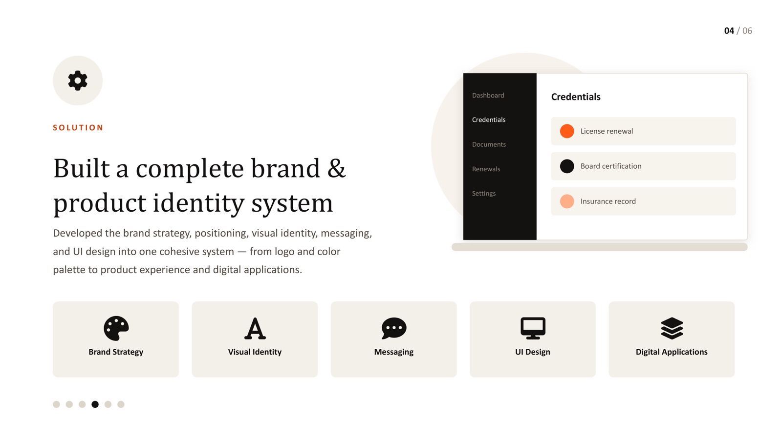
- Define how status and credibility get communicated in the UI (colour, iconography, copy tone) as part of the brand system, not as a separate product decision later
- Build the visual identity and the UI components in parallel, so the product doesn't end up "off-brand" the moment engineering starts building
- Document how the identity applies to dashboards and data-heavy screens specifically - these are usually the parts a generic brand guideline skips entirely
Accessibility is a brand decision here, not just a compliance one
In most industries, WCAG accessibility gets treated as a legal checkbox. In healthcare, it's closer to a trust signal - if a platform can't be read clearly by someone with low vision, or navigated without a mouse, that's a credibility problem as much as a compliance one. Building A/AA/AAA accessibility into the design system from day one - contrast ratios, focus states, semantic structure - means it never becomes a rushed retrofit before an audit. For more on this specifically, see our guide to WCAG accessibility for healthcare software.
The healthcare products that feel trustworthy almost never have the flashiest identity - they have the most consistent one. Every credentialing platform I've worked on had the same underlying problem: good intentions, fragmented execution. Brand team building one thing, product team shipping another, and nobody owning the seam between them.
My approach on a recent healthcare credentialing platform was to treat the brand and product system as a single deliverable from day one - positioning first, then visual identity and messaging, then UI design and digital applications, all reviewed against the same standard. The result wasn't a flashier brand. It was one that held together everywhere a user actually encountered it, which is the only kind of consistency that reads as trustworthy in this industry.
What this looks like in practice
If you're building or rebuilding a brand for a healthcare SaaS platform, the practical sequence is usually: define positioning and messaging, build the visual identity system (logo, colour, type), apply it to the product's actual UI states, and document how it holds together across web, mobile and any internal tools. This is close to the exact path we took on a real healthcare credentialing platform case study - full brand and product identity system, built as one thing rather than two.
If your team is based in Mumbai's BFSI-adjacent healthcare and insurance sector, or you're working out of Hyderabad's life sciences and pharma corridor, the trust and compliance expectations are usually even higher - worth reading how this applies specifically on our Mumbai and Hyderabad pages.
Building or rebuilding a healthcare brand?
Let's talk about what a unified brand and product identity system would look like for your platform.