Marketing, e-commerce and digital leads at B2B equipment, trade and hospitality-supply companies who suspect their website needs a redesign but are not sure what is actually wrong.
- Audit before you redesign. A visual refresh on top of a structural problem produces a better-looking version of the same broken site.
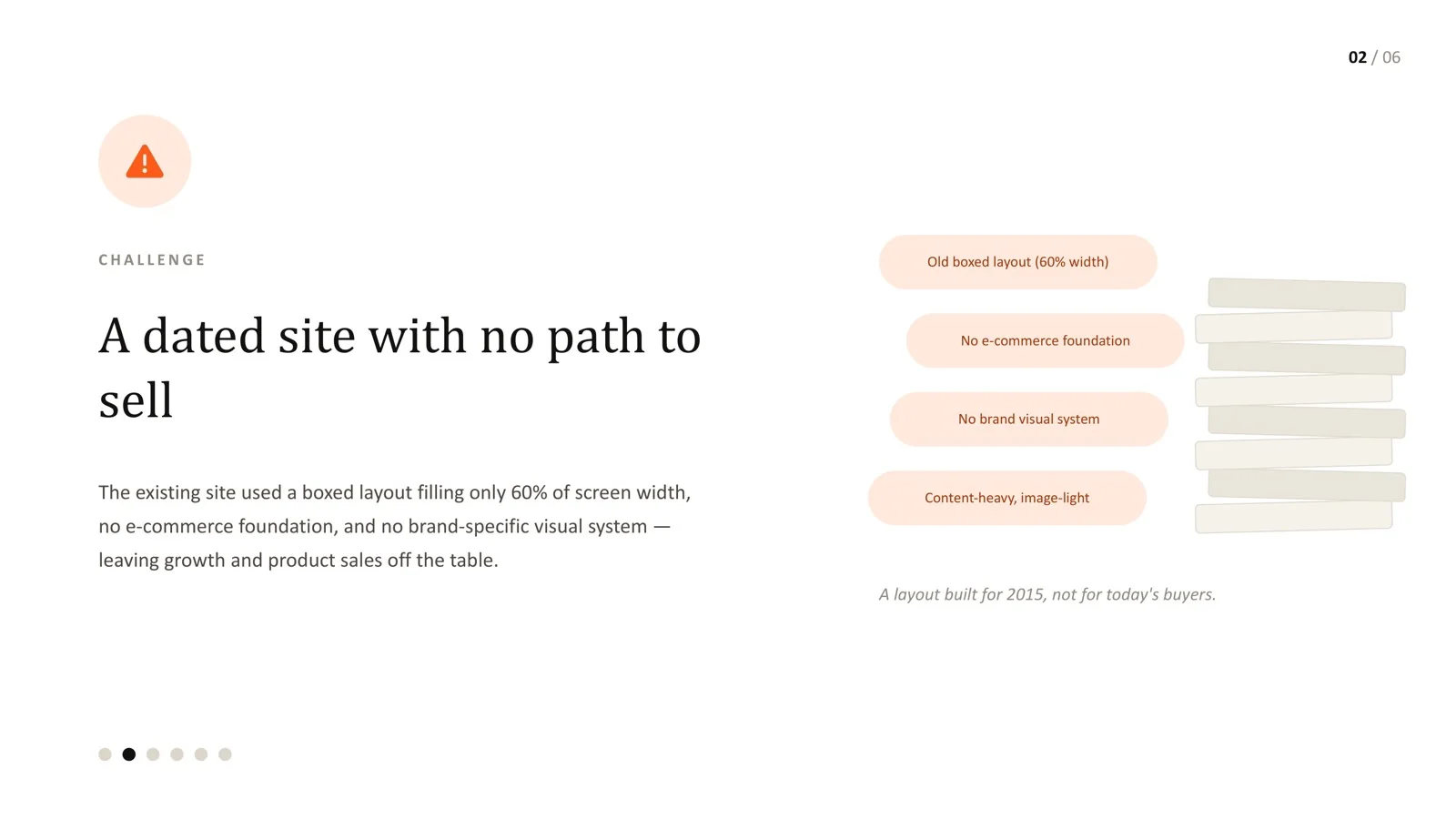
- On a B2B hospitality equipment platform, the root issue was structural: a boxed layout using only 60% of screen width, content-heavy and image-light, with no e-commerce foundation.
- Run three research tracks: direct competitors, category leaders, and adjacent industries that match how your buyers shop.
- Combine heuristic evaluation with journey mapping for each buyer type, then rank every finding by impact and effort.
- Good audit output is specific: every recommendation tied to a page, a persona or a navigation decision.
When a B2B equipment website starts to feel dated, the usual instinct is to jump straight to a visual refresh: new colours, new typography, a more modern layout. That skips the step that decides whether the redesign will work - understanding exactly what is broken and why before choosing what to change.
This guide sets out a practical audit framework for B2B equipment and trade websites, using a real audit of a hospitality equipment platform as the worked example.
Why B2B equipment sites need an audit first
B2B equipment buying is slow, researched and collective. Forrester's research found that 86% of B2B purchases stall during the buying process, and a typical decision involves 13 internal stakeholders and nine external influencers. Your website is one of the few places all of those people can inspect without talking to sales. If it makes specifications hard to find, hides the difference between models or looks like it has not been updated in years, it adds friction to a process that already stalls easily.
At the same time, attention is short. Jakob Nielsen's analysis of browsing data found that users often leave web pages in 10-20 seconds unless the page communicates its value quickly. An audit tells you where those seconds are being wasted.
Step 1: Establish what the site is actually doing wrong
Start by describing the current site honestly, before any opinions about what it should become. On the hospitality equipment audit, this first pass found:
- A boxed layout filling only 60% of screen width, so product imagery and specifications were cramped on large screens.
- Content-heavy, image-light pages, when buyers of physical equipment want to see the product clearly.
- No e-commerce foundation - no clear path from finding a product to buying or requesting a quote.
- No brand-specific visual system, so pages looked assembled rather than designed.
- Buried selling points - genuine strengths of the business were hard to find.
- A single navigation structure trying to serve three very different buyer types.
None of these is a "style" problem you fix with a new palette. They are structural problems.
Step 2: Define the buyers and their key tasks
An audit without buyer context turns into a list of personal preferences. Define who uses the site and what each group needs to accomplish. On this project, research identified three buyer types - a decisive café owner, a first-time operator and a spec-comparing equipment buyer - described in detail in our piece on persona-led UX for B2B buyers.
For each buyer, write two or three critical tasks, for example:
- Find a specific model and check availability.
- Understand which type of equipment suits a new kitchen.
- Compare two products on dimensions, power requirements and warranty.
These tasks become the backbone of the journey review in step 5.
Step 3: Benchmark across three tracks
A useful audit does not stop at "what do our direct competitors do". It runs three tracks in parallel:
| Track | What you review | What you are looking for |
|---|---|---|
| Direct competitors | The closest alternatives your buyers also consider | Table stakes: what buyers will expect to find, and where you fall short |
| Category leaders | Best-in-class players in adjacent B2B categories | Patterns that set a higher bar - specification presentation, configurators, quote flows |
| Adjacent industries | Sites outside your category that match how your buyers shop | Ideas competitors have not adopted yet, such as comparison tools or guided selection |
The third track is the one teams skip most often, and it is frequently the most useful. B2B buyers form expectations from every digital experience they use, not only the ones in your category.
Step 4: Run a heuristic evaluation
A heuristic evaluation is a structured review of the interface against established usability principles. The most widely used set is Jakob Nielsen's 10 usability heuristics, first published in 1994 and still unchanged in substance. Nielsen Norman Group recommends that three to five people evaluate independently, because any single evaluator misses issues.
For equipment sites, the heuristics that surface the most issues tend to be:
| Heuristic | Typical issue on B2B equipment sites |
|---|---|
| Match between system and the real world | Navigation named after internal departments rather than what buyers call things |
| Recognition rather than recall | Buyers must remember specifications from one page to compare on another |
| Consistency and standards | Product pages laid out differently depending on who built them |
| Visibility of system status | Quote requests disappear into a void with no confirmation or timeframe |
| Aesthetic and minimalist design | Marketing copy crowding out the specifications buyers came for |
| Error prevention | Forms that reject part numbers or phone formats without explanation |
Record each issue with the page, the heuristic, a screenshot and a severity rating.
Step 5: Map the journeys, not just the pages
Page-by-page reviews miss what matters most: whether the connected journey makes sense for a real buyer. Walk each critical task from the likely entry point - search, a category page, a product page from Google - through to the point of action. Note every hesitation, dead end and repeated step.
On the hospitality audit, journey mapping exposed the core problem: the same navigation was being asked to serve three buyers with opposite needs. A decisive buyer was slowed by orientation content, a newcomer was dropped into product lists without context, and a comparing buyer found marketing copy where specifications should be.
Step 6: Prioritise by impact and effort
An audit is only useful if a team can act on it. Score every finding and sort:
| Priority | Impact on buyer tasks | Effort to fix | Typical examples |
|---|---|---|---|
| Fix first | High | Low | Missing specification tables, unclear quote confirmation, broken search for model numbers |
| Plan next | High | High | Navigation restructure, product template redesign, e-commerce foundation |
| Quick polish | Low | Low | Inconsistent button styles, image sizing, copy tweaks |
| Park | Low | High | Nice-to-have features with little evidence of demand |
Step 7: Write output a team can build from
A 60-page report of generic best practice rarely gets used. Good audit output is short, specific and visual:
- An executive summary of the five to ten findings that matter most.
- Each finding tied to a specific page, persona or navigation decision, with evidence.
- A recommended sitemap or template direction where the problems are structural.
- A prioritised roadmap showing what to fix first and what belongs in the redesign.
On the hospitality project, every recommendation was tied to a page, persona or navigation decision, ready for the team to build from. The redesign that followed used a full-width layout, a flat sitemap with a mega-menu so every page sat within two clicks of home, and detail-first product templates.
The most useful thing an audit can do is stop a team redesigning the wrong thing. On this project, a straight visual refresh would have shipped a better-looking version of a structurally broken site - the same navigation problems and the same missing e-commerce foundation, just prettier.
The value was in specificity. Every recommendation pointed at a page, a persona or a navigation decision. That is what makes an audit worth the time: it should tell you exactly what to fix first, not just confirm that something feels off.
Frequently asked questions
How long does a UX audit of a B2B equipment site take?
A focused audit of a mid-sized site - buyer definition, benchmarking, heuristic review, journey mapping and a prioritised report - typically takes a few weeks. Very large catalogs or many regional sites take longer.
Do we need analytics access for an audit?
It helps a great deal. Analytics shows where people enter, search and leave, which focuses the review. An audit can still be done without it, using heuristic review, benchmarking and a few buyer interviews.
Should the audit include accessibility?
Yes, at least a WCAG-informed review of templates. Procurement teams increasingly ask about accessibility, and many issues (contrast, labels, keyboard access) are cheap to fix during a redesign.
Can we skip the audit if we already know we need a redesign?
You may know you need one, but the audit tells you what the redesign must fix and what it can keep. Skipping it often means redesigning the visuals while keeping the structural problems.
What does the output of a good audit look like?
A short, prioritised list of findings with evidence and screenshots, each tied to a page or journey, plus a recommended direction for structure and templates where needed.
Not sure if your site needs a redesign or a rethink?
A fixed-scope audit finds out before you spend on the wrong fix.
Sources
Every statistic in this article links to its original publisher. Figures were checked against these sources on September 29, 2026.
- The State Of Business Buying, 2024 - Forrester, 2024
- The State Of Business Buying, 2026 - Forrester, 2026
- How Long Do Users Stay on Web Pages? - Jakob Nielsen, Nielsen Norman Group, 2011
- 10 Usability Heuristics for User Interface Design - Jakob Nielsen, Nielsen Norman Group, 1994 (updated 2024)
- How to Conduct a Heuristic Evaluation - Nielsen Norman Group