Product, marketing and e-commerce leads at B2B equipment, trade and hospitality-supply companies whose website serves more than one kind of buyer.
- B2B sites are usually designed for one imaginary "typical visitor". Real traffic contains several buyer types with different knowledge and different jobs to do.
- On a B2B hospitality equipment redesign, research surfaced three: a decisive café owner, a first-time operator and a spec-comparing equipment buyer. One journey served none of them well.
- Useful UX personas are defined by what the buyer already knows and what they came to do - not by job title, company size or demographics.
- Each persona needs a different information priority: speed, guidance or detail. That changes navigation, page templates and content, not just copy.
- Build personas from evidence (sales conversations, support questions, on-site search, analytics paths, benchmarking), then test each journey with a small group of real users.
Most B2B websites are built around a quiet assumption: there is one typical visitor, and the navigation, homepage and product pages should be tuned for them. The assumption is rarely written down, which is exactly why it survives. It shows up in a navigation menu that mirrors the org chart, a homepage that tries to say everything, and product pages written for whoever last complained.
The problem is that B2B traffic is almost never one person. Forrester's 2026 State of Business Buying research found that a typical buying decision now involves 13 internal stakeholders and nine external influencers. Even when a single owner-operator is buying for their own business, the people arriving on your site differ wildly in how much they already know. A design that averages across them produces a journey that fits nobody.
Marketing personas and UX personas are different tools
Most companies already have personas somewhere - usually a slide from a marketing workshop with a stock photo, an age bracket and a list of "pain points". Those documents are useful for campaign targeting. They are close to useless for interface decisions, because nothing on them tells a designer what should go in the navigation or what a product page should show first.
A UX persona answers different questions. What does this person already know when they arrive? What are they trying to get done in this visit? What would slow them down? What would make them trust the page enough to take the next step?
| Marketing persona | UX persona | |
|---|---|---|
| Built around | Demographics, role, company size | Existing knowledge and the task in hand |
| Answers | Who should we target and with what message? | What should this page show first, and what can wait? |
| Typical source | Workshops, CRM segments, sales opinion | Interviews, support logs, on-site search, analytics paths, usability tests |
| Changes | Ad copy, campaigns, email sequences | Navigation, page templates, content order, calls to action |
| Failure mode | Stereotypes that nobody designs from | Too many personas to act on |
The practical difference: a marketing persona might say "Operations manager, 35-50, mid-sized hotel group". A UX persona says "Knows exactly which combi oven model she wants, needs to confirm availability and delivery, will leave if made to browse a category tree". Only the second one changes a screen.
The three buyers we found on a hospitality equipment platform
On a research-led redesign for a B2B hospitality equipment platform, the old site showed every visitor the same journey, regardless of who they were or what they needed. Research across customer conversations, the existing site structure and competitor benchmarking surfaced three distinct buyers. None of them were defined by industry vertical or company size. They were defined by what they knew and what they came to do.
| Buyer | What they already know | What they came to do | What the old site did to them | What the redesign gave them |
|---|---|---|---|---|
| Café owner | Exactly which product she needs | Find it, confirm it, buy or enquire | Buried her in the same generic navigation as everyone else | A direct, low-friction path from search to product |
| First-time operator | Very little - new to the category | Understand options before committing | Dropped them into product lists full of trade terms like "GN pan compatible" | A guided flow that explains the category before asking for a decision |
| Equipment buyer | The specs that matter to them | Compare vendors side by side | Offered thin marketing copy where specifications should be, forcing a PDF request or a call | Detail-first product pages built for comparison |
Notice what happened when one design tried to serve all three. The café owner was slowed down by orientation content she did not need. The first-time operator got a product list with no context. The equipment buyer got persuasion where they wanted data. Each compromise made the site slightly worse for everyone - which is the typical outcome of designing for an average.
How to find the personas already in your traffic
You do not need a large research budget to find your UX personas. You need evidence from the places where buyers already tell you what they want. On most B2B projects I start with five sources and look for patterns that repeat across them.
- Sales and account managers. Ask them to describe the last ten conversations that went well and the last five that went badly. Listen for what the buyer knew on arrival and what they asked first. Salespeople rarely describe demographics - they describe knowledge gaps.
- Support and enquiry inboxes. Questions like "does this fit a standard counter?" or "what's the difference between these two models?" point to buyers who could not find an answer on the site.
- On-site search logs. Exact model numbers suggest decisive buyers. Broad category words ("commercial fridge") suggest people still learning. Comparison phrases ("vs", "difference") suggest evaluators.
- Analytics paths. Look at landing pages and the next two clicks. Visitors who land on a product page and leave fast behave differently from visitors who move through several category pages. Treat this as a clue to investigate, not a conclusion.
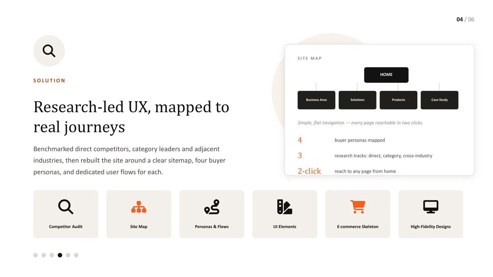
- Benchmarking across three tracks. Review direct competitors, category leaders in adjacent B2B markets, and patterns from outside the category that match how your buyers shop. The third track is the one most teams skip and it is often the most useful.
Then write each candidate persona as a single sentence in this form: arrives knowing X, wants to do Y, is slowed down by Z. If two personas produce the same sentence, merge them. If a persona does not change any design decision, delete it. Three to four is a workable number for most B2B sites; more than five usually means the segmentation is still demographic.
Turning personas into navigation and page templates
Personas only earn their keep when they change structure. On the hospitality project, the changes fell into three layers.
Entry points. Each buyer needs a sensible way in without being asked to self-identify. Forcing visitors through "Are you new to commercial kitchens?" gates adds a step for everyone. It is better to let intent show through behaviour: a prominent search that handles model numbers serves the decisive buyer, category landing pages with short explainers serve the newcomer, and comparison tools linked from product pages serve the evaluator.
Navigation. The redesign moved to a flat sitemap with a mega-menu - home, business area, solutions, products and case studies - so every page sat within two clicks of the homepage for all three buyers. I have written separately about why flat structures work for large B2B catalogs; the short version is that depth optimises for the people maintaining the site, not the people buying from it.
Page templates. The same product needs to answer different first questions for different buyers, and the fix is ordering rather than separate pages:
| Page area | Serves the decisive buyer | Serves the first-time buyer | Serves the comparing buyer |
|---|---|---|---|
| Above the fold | Model name, availability, price or enquiry action | One-line plain-language description of what the product is for | Key specifications in a scannable block |
| Mid-page | Delivery and installation details | "Is this right for me?" guidance and common use cases | Full specification table, dimensions, compliance marks |
| Lower page | Related accessories | Links to category guides | Comparison with similar models, downloadable data sheet |
The page stays single and indexable; the hierarchy simply acknowledges that three kinds of reader will scan it.
Content priorities: speed, guidance and detail
A useful shorthand for any multi-persona B2B site is to ask which of three priorities a page is serving and whether it is doing so on purpose.
- Speed serves buyers who already know what they want. Strip steps, surface search, keep calls to action obvious, and avoid interstitial content.
- Guidance serves buyers who are new to the category. Explain terms in plain language, show examples of use, and delay detailed choices until the basics are clear.
- Detail serves buyers who are evaluating. Give them complete, structured, comparable information - and do not hide it behind a form unless there is a genuine commercial reason.
Most B2B pages try to do all three at equal volume and end up doing none of them well. Deciding which priority leads, page by page, is one of the highest-leverage decisions in a redesign.
Test each journey with the people it was built for
Persona work turns into opinion again if it is never tested. The good news is that testing each journey does not require large samples. Jakob Nielsen's widely cited analysis found that five participants uncover roughly 85% of usability problems in a given design, and recommends several small rounds over one large study. For a multi-persona site, that means a few participants per persona, given the task that persona actually came to do:
- Decisive buyer: "Find the model you need and get a delivery date."
- First-time buyer: "You are opening your first café. Work out which refrigeration you need."
- Comparing buyer: "Shortlist two ovens that meet these specifications."
Measure whether each group completes its own task, how long it takes and where they hesitate. A journey that tests well for one persona and badly for another is exactly the kind of finding a single-persona design hides.
Common mistakes with persona-led UX
- Personas based on job titles. Two "procurement managers" can behave completely differently depending on how familiar they are with the category.
- Self-selection gates. Asking visitors to choose a path before they see anything useful adds friction and often mislabels people.
- Separate microsites per persona. Duplicating content across persona sections creates maintenance debt and splits search visibility. Reorder shared pages instead.
- Personas nobody revisits. Buyer knowledge changes as a market matures. Re-check the evidence at least once a year.
- Simplifying uniformly. Fewer menu items help the newcomer and slow down the expert. Differentiation beats blanket simplification.
The instinct on most B2B redesigns is to simplify the navigation into fewer, cleaner categories. Applied uniformly, that is usually the wrong move: fewer categories add friction for a buyer who already knows what they want, while a first-time buyer needs more structure, not less.
The real fix on the hospitality project was differentiation. Distinct flows for each persona, reachable from one flat, well-organised sitemap, let each buyer get the experience they needed without a one-size-fits-all compromise. That is the practical value of persona-led design - not empathy as a slogan, but specific, different decisions for specific, different buyers.
Frequently asked questions
How many UX personas should a B2B website have?
Usually three or four. Each persona should change at least one design decision - an entry point, a navigation label, a page order or a call to action. If a persona does not change anything, merge it into another one.
Can I build personas from analytics alone?
Analytics shows what people did, not what they knew or intended. Use it to find patterns worth investigating, then confirm them with sales conversations, support questions, search logs and a few interviews.
Should visitors choose a persona path on the homepage?
Rarely. Self-selection gates add a step for everyone and people often pick the wrong option. It usually works better to design entry points - search, category guides, comparison tools - that each persona finds naturally.
Is this only relevant for large catalogs?
No. Any B2B site whose visitors differ in how much they know benefits, whether it sells equipment, software or services. Large catalogs simply make the problem more visible.
How long does persona research take before a redesign?
For most mid-sized B2B sites, a focused research and benchmarking phase fits into a few weeks alongside an audit. The exact time depends on how easy it is to access sales teams, support data and real buyers.
Showing every visitor the same journey?
Let's map your real buyer personas before redesigning anything.
Sources
Every statistic in this article links to its original publisher. Figures were checked against these sources on September 29, 2026.
- The State Of Business Buying, 2026 - Forrester, 2026
- The State Of Business Buying, 2024 - Forrester, 2024
- Why You Only Need to Test with 5 Users - Jakob Nielsen, Nielsen Norman Group, 2000