E-commerce managers, product owners and UX designers responsible for navigation and category structure on B2B catalog websites with hundreds or thousands of products.
- Deep, nested category trees feel organised to the people who built them and confusing to everyone else.
- A useful target for large B2B catalogs: every category, solution area and key resource reachable within two navigation decisions from the homepage.
- Treat the 2-click target as a design test, not a law. Research shows click count alone doesn't predict success - clear labels ("information scent") matter more.
- A flat sitemap paired with a well-organised mega-menu is the practical way to hold the target as the catalog grows.
- Structure around buyer intent, not internal departments, and validate with card sorting and tree testing before building.
Large B2B catalogs create a specific temptation. As the number of products grows, so does the instinct to organise them into deeper category trees: equipment, then refrigeration, then commercial refrigeration, then reach-in, then two-door. It feels logical while you are building it. For the buyer, every extra level is another guess about where the product might be - and another moment to lose confidence.
This article covers how to structure a large B2B catalog so buyers can find things quickly, why a "2-click" target is useful when treated correctly, and how we applied it on a hospitality equipment redesign.
Why depth fails in B2B catalogs
Deep hierarchies break down for three reasons:
- Labels become ambiguous. The further down a tree you go, the more categories overlap. Is a blast chiller under refrigeration or food preparation?
- Buyers cannot see what exists. Hidden sub-levels mean people cannot tell whether the site stocks what they need without clicking in.
- The structure mirrors the business, not the buyer. Deep trees usually reflect product lines, departments or supplier relationships - organising for the people maintaining the site, not the people buying from it.
The 2-click target, and what the research actually says
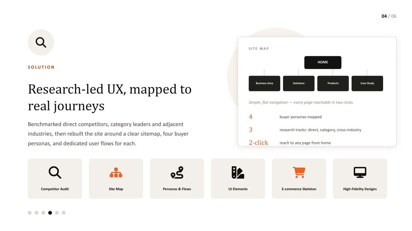
The rule we used on the hospitality redesign is simple to state: every category, solution area and key resource should be reachable within two navigation decisions from the homepage. Not every individual product needs to be two clicks away - with thousands of SKUs that is impossible - but the path to the right category should never require more than two guesses.
It is worth being honest about the research here. The older "3-click rule" - the idea that users give up if they cannot find something in three clicks - is not supported by evidence. Nielsen Norman Group describes it as an arbitrary rule of thumb that is not backed by data, citing a study that found user drop-off does not increase when tasks take more than three clicks, nor does satisfaction fall. What matters is whether each click feels like progress.
So why use a 2-click target at all? Because it is a useful constraint on structure. It forces a flat, broad hierarchy and makes you expose the second level directly, which is exactly what improves information scent - the confidence a label gives users that they are heading the right way. Used as a test ("can a buyer reach this category in two confident decisions?"), it produces better navigation than counting clicks after the fact.
Flat sitemap plus mega-menu
The practical way to hold the target at catalog scale is a flat sitemap with a small number of top-level sections, each expanding into a mega-menu that shows the next level directly. On the hospitality equipment platform, the redesigned structure used five top-level sections - home, business area, solutions, products and case studies - so every page sat within two clicks of home for all three buyer types.
| Deep tree | Flat sitemap + mega-menu | |
|---|---|---|
| Top-level items | Few, very broad | Four to seven, clearly distinct |
| Second level | Hidden behind category landing pages | Shown directly in the menu |
| Clicks to a category | Three to five | One or two |
| How it grows | Adds levels | Adds breadth within existing sections |
| Main risk | Buyers get lost or give up | Menu becomes overcrowded without clear grouping |
| Best for | Very small sites | Large catalogs with varied buyers |
Mega-menus have a reputation problem because badly built ones are overwhelming. The fix is structure inside the menu, not avoiding the pattern:
- Group links under clear headings, and keep each group short enough to scan.
- Use buyer language for labels, not internal product codes.
- Include one or two featured links (a buying guide, a popular category) rather than promotional clutter.
- Make it work with a keyboard and on touch screens - open on click as well as hover, and close predictably.
Structure around buyer intent, not internal categories
The most common IA mistake in B2B catalogs is not depth - it is organising the site around how the business is structured. A buyer does not care which division owns a product line. They care whether the thing they need is easy to find.
Buyers arrive with different kinds of intent, so a good catalog offers more than one route to the same products:
| Buyer intent | Useful route | Example |
|---|---|---|
| Knows the product | Search that handles model numbers and synonyms | "RF-2D" or "two door reach-in" |
| Knows the job to be done | Solution or application pages | "Equipment for a new café" |
| Knows the category | Category navigation in the mega-menu | Refrigeration > Reach-in |
| Comparing options | Filters and comparison views | Capacity, dimensions, power supply |
This connects directly to persona-led design. On the hospitality project, three buyer types - a decisive café owner, a first-time operator and a spec-comparing buyer - each needed a different route in. Read more in persona-led UX for B2B buyers.
Validate before you build
Two inexpensive research methods catch most IA problems before any design work:
- Open card sorting. Give buyers (or people like them) product names on cards and ask them to group and name the groups. You learn how they think about the catalog and what they call things.
- Tree testing. Give participants the proposed structure as text only and ask them to find specific items. Success rates and first clicks show which labels mislead.
Run tree tests with representative tasks for each buyer type. If one category keeps attracting wrong first clicks, the label is the problem, not the buyer.
Keep search and filters in step with navigation
In large catalogs, navigation and search do different jobs and must agree with each other:
- Search should understand model numbers, part numbers, common misspellings and trade synonyms.
- Filters should use the same attributes buyers compare on, with the same names used on product pages.
- Category names in search results, breadcrumbs and the mega-menu should match exactly.
- Breadcrumbs should reflect the flat structure so buyers always know where they are.
Test your own site
Pick five products from different parts of your catalog. From the homepage, count the navigation decisions needed to reach each one's category, and note any moment where you had to guess. Then ask three people unfamiliar with your business to do the same. If any path takes more than two confident decisions, or anyone guesses wrong at the first level, you have a concrete, fixable IA problem - not a vague "the site feels cluttered" complaint.
Every over-nested B2B navigation I have inherited was built with good intentions. Someone was trying to keep things organised as the catalog grew, and depth felt like the responsible way to do it. It rarely is. Depth optimises for the person maintaining the site, not the person buying from it.
On the hospitality catalog redesign, moving to a flat sitemap with a mega-menu was not simplification for its own sake. It responded directly to research showing buyers could not find what they needed under the old structure. The 2-click target is not a law of nature; it is a test you can hold your sitemap against, and that is what makes it useful.
Frequently asked questions
Is the 3-click rule real?
No. Research summarised by Nielsen Norman Group found that people do not abandon tasks simply because they take more than three clicks. What matters is whether each step clearly moves them closer to their goal.
How many items should a mega-menu have?
There is no fixed number, but groups should be short enough to scan at a glance and clearly labelled. If buyers must read every link to find one, the menu needs better grouping, not fewer categories.
Should products appear in more than one category?
Yes, when buyers genuinely look for them in more than one place - for example, a product that belongs to both a category and a solution. Keep one canonical product page and link to it from each route.
How do we handle thousands of SKUs?
Use navigation to get buyers to the right category quickly, then rely on good filters, sorting and search within the category. No navigation structure alone can surface thousands of products.
Does flat IA help SEO?
Generally, yes: important category pages sit closer to the homepage, receive more internal links and are easier for search engines to discover. Keep URLs and breadcrumbs consistent with the structure.
Catalog grown past what your navigation can handle?
Let's rebuild the sitemap around how your buyers actually think, not your internal categories.
Sources
Every statistic in this article links to its original publisher. Figures were checked against these sources on September 29, 2026.
- The 3-Click Rule for Navigation Is False - Page Laubheimer, Nielsen Norman Group, 2019