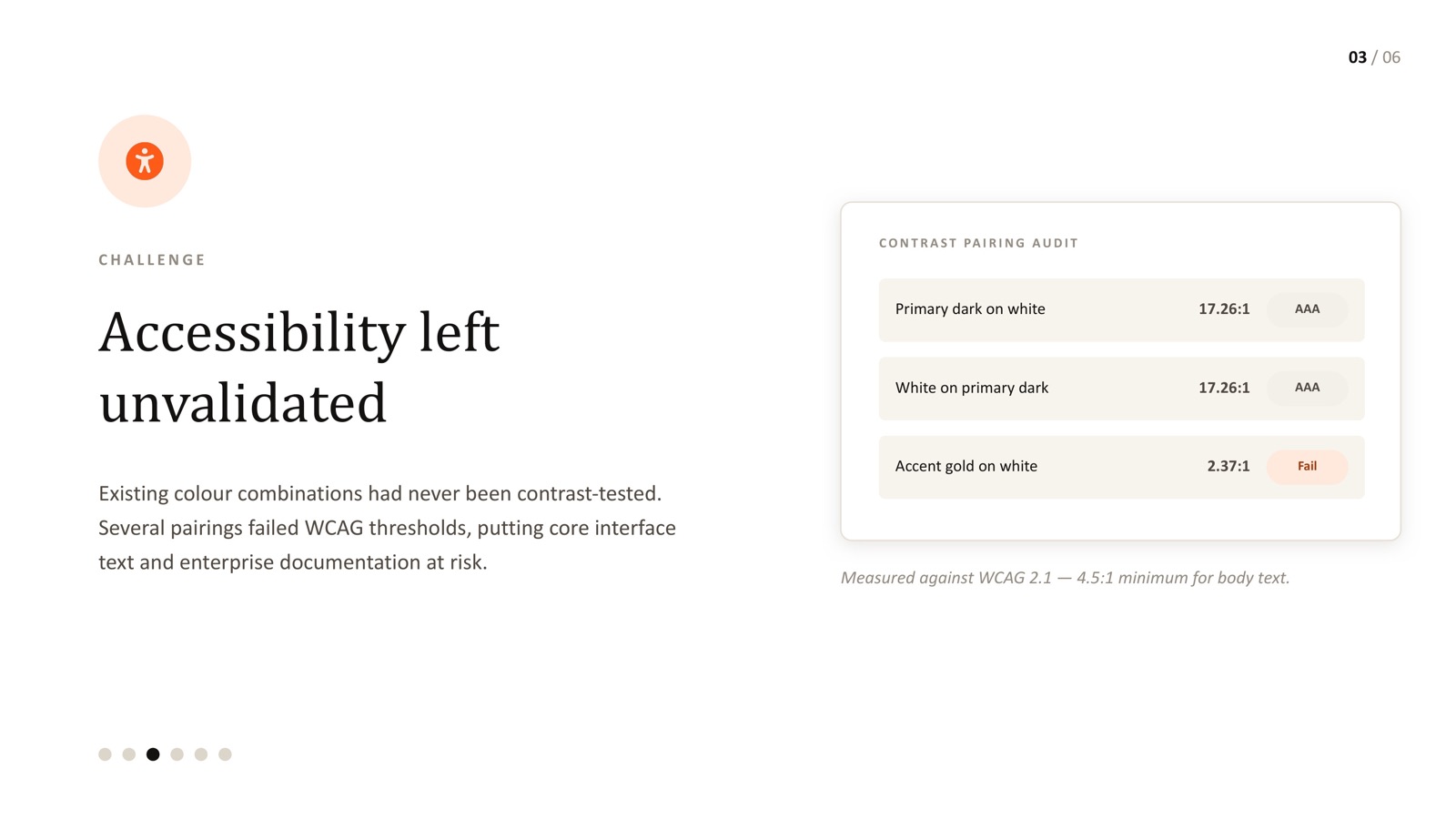
- Most colour systems have never actually been contrast-tested - they were chosen on taste, then assumed to be fine.
- A real audit found one accent-on-white pairing at 2.37:1, well below the 4.5:1 minimum for body text.
- After rebuilding the system, the primary dark/white pairing reached 17.26:1 - comfortably AAA.
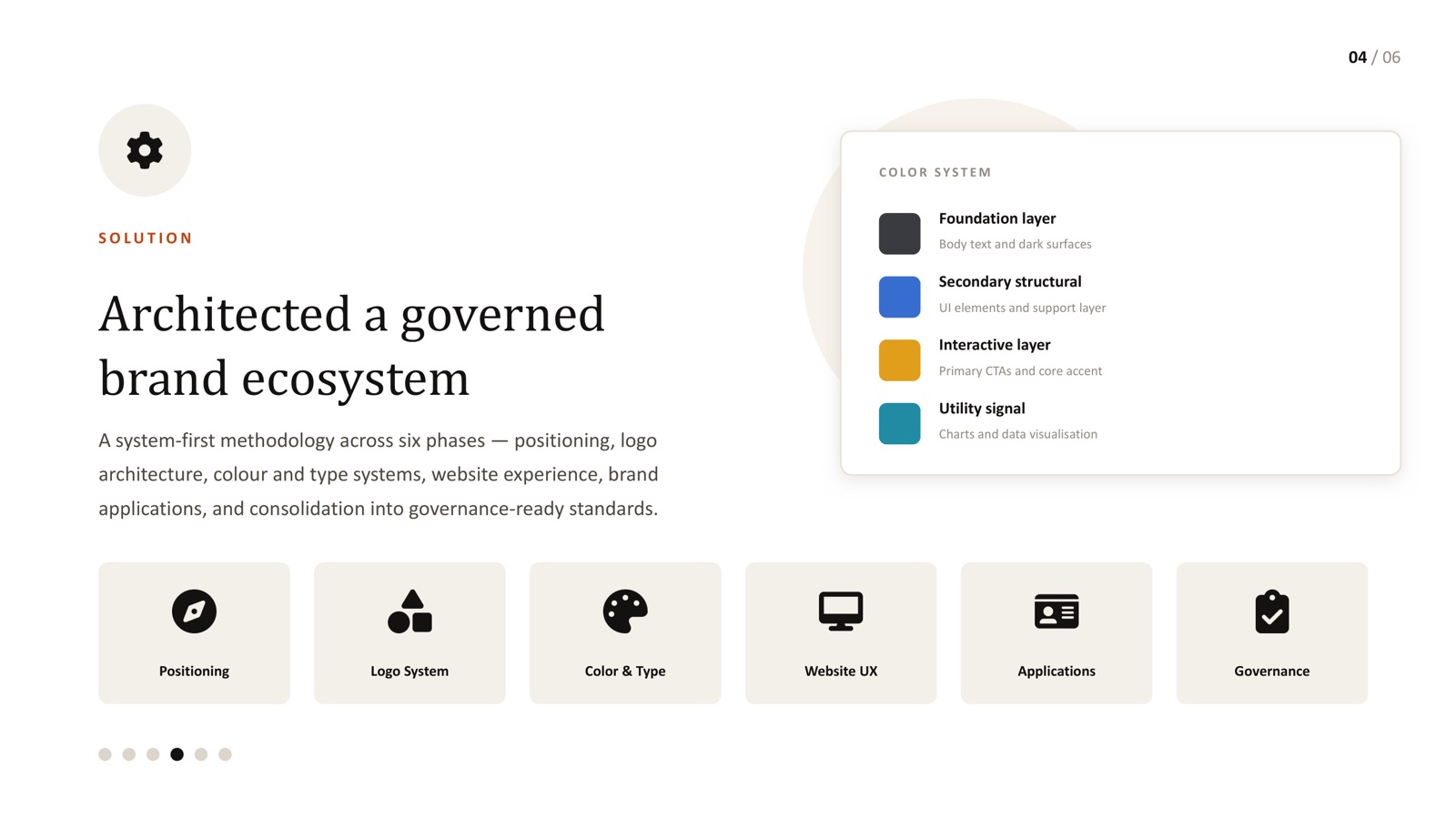
- A four-layer colour system (foundation, structural, interactive, utility) makes future pairings easier to test and reuse.
- This audit is part of the full AI enterprise brand ecosystem case study.
Ask most product teams whether their colour system passes WCAG contrast requirements, and the honest answer is usually "we assume so." Colours get chosen for how they look together, not tested against a contrast formula - which means a palette can look polished in a mockup and still fail real accessibility standards the moment it's used for actual body text or interactive states.
Here's what that looked like on a real AI enterprise brand project, and what changed once the system was actually tested.
The before: a pairing that failed by a wide margin
WCAG 2.1 sets a minimum contrast ratio of 4.5:1 for normal body text. When we audited the existing colour system on this project, one of the accent-on-white pairings already in active use measured 2.37:1 - well under half the required ratio. That's not a marginal fail; it's a pairing that would be genuinely difficult to read for a meaningful share of users, including anyone with low vision or working in bright light on a mobile screen.
This wasn't a one-off mistake. It's what happens by default when a colour system is chosen visually and never tested formally - accent colours, in particular, are picked for how much they "pop," which is often in direct tension with how readable they are as text.
The fix: a layered system, tested by design
Rather than patch the one failing pairing, we rebuilt the colour system with accessibility as a structural property, not an afterthought - four layers, each with a defined role:
- Foundation layer - for body text and dark surfaces, tested first because it carries the most reading weight
- Secondary structural layer - for UI elements and supporting structure
- Interactive layer - for primary CTAs and the core accent colour
- Utility layer - for charts and data visualisation, where contrast needs differ from body text
Every pairing across all four layers was re-tested against WCAG 2.1 before being approved. The primary dark-on-white combination reached 17.26:1 - comfortably into AAA territory, well beyond the AA minimum most teams target.
Why this matters even if you're not "required" to comply
Plenty of B2B and enterprise AI products aren't under strict regulatory accessibility mandates, and teams sometimes deprioritise contrast testing as a result. That's a mistake for two reasons: first, enterprise procurement and security reviews increasingly ask about accessibility compliance directly; second, poor contrast measurably degrades usability for a large share of ordinary users, not just those with diagnosed vision impairments - low light, screen glare and fatigue all effectively lower everyone's contrast tolerance.
The 2.37:1 number is the part of this project people remember, but the more useful lesson is upstream of it: almost no colour system gets contrast-tested unless someone makes it a required step, because it's invisible until you specifically go looking for it. Nobody chose that failing pairing carelessly - it just never got checked.
Building a layered colour system where every pairing is tested by default, rather than tested only when someone raises a flag, is the difference between accessibility as a one-time fire drill and accessibility as a property of the system. That's the version that actually holds up as the product keeps shipping new screens.
Checking your own system
If you've never formally tested your product's colour pairings against WCAG 2.1, it's worth assuming at least one is failing until proven otherwise - that was true here, and it's true more often than teams expect. The full rebuild is documented in our AI enterprise brand ecosystem case study. This matters especially for teams in Bangalore's SaaS and AI sector, where enterprise buyers increasingly factor accessibility compliance into procurement decisions.
Not sure if your colour system actually passes WCAG?
Let's test your real pairings, not just assume they're fine.