What the work covers
| Deliverable | What it defines | Why it matters |
|---|
| Content and feature inventory | Everything that exists today and how it's used | You can't structure what you haven't counted |
|---|
| Mental-model research | How users group and name things | Labels and groups match their expectations, not yours |
|---|
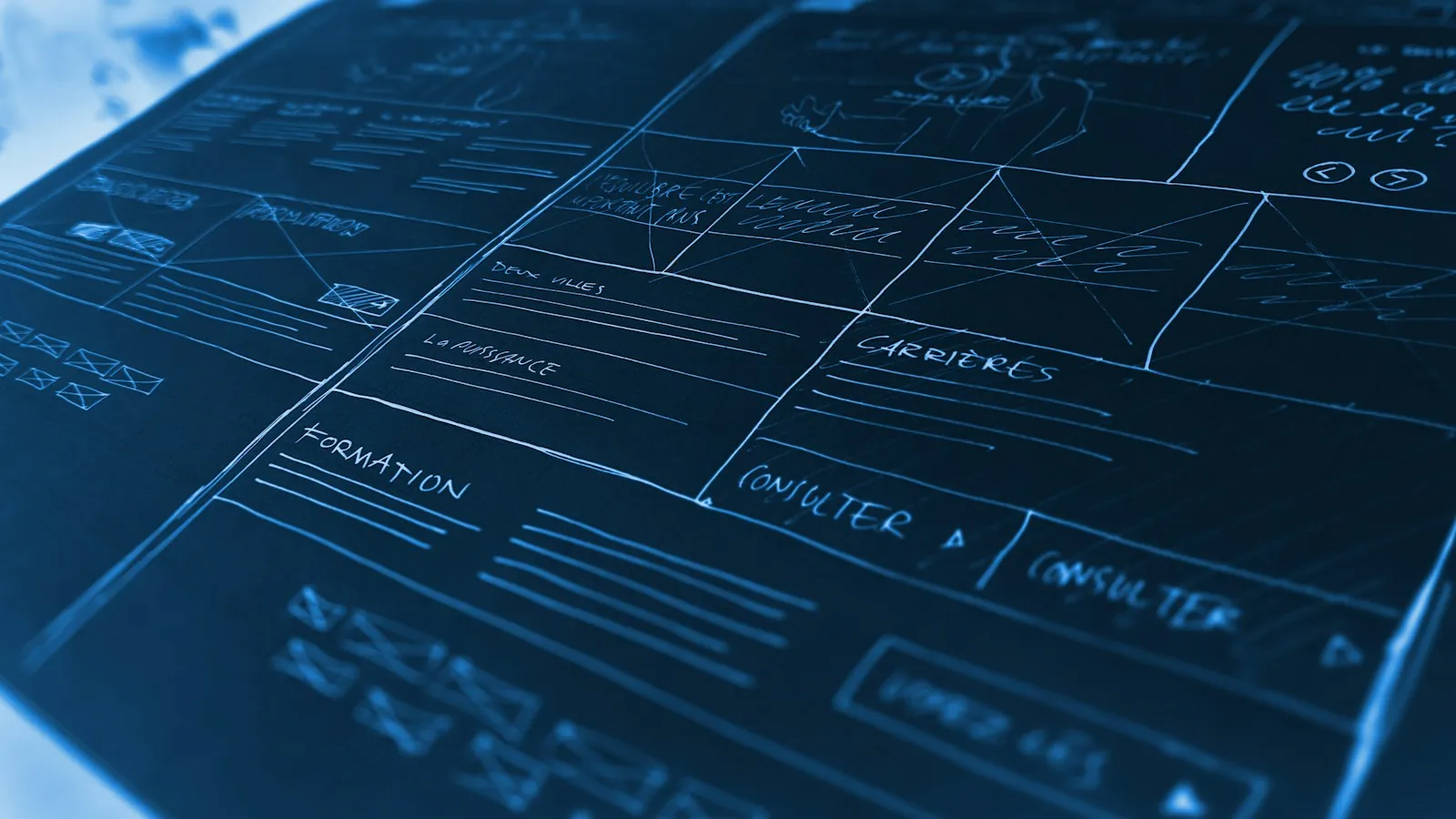
| Sitemap / structure map | Hierarchy, relationships and depth | A shared picture of the product for design and engineering |
|---|
| Navigation model | Global, local and contextual navigation; breadcrumbs; search | How people move and always know where they are |
|---|
| Taxonomy and labels | Categories, tags, attribute names and controlled vocabulary | Consistent naming across navigation, filters and content |
|---|
| Content model | Content types, fields and relationships | Templates, filters and search that stay consistent at scale |
|---|
Research that de-risks structure
Two inexpensive methods catch most structural problems before design:
- Card sorting. Participants group items and name the groups. Open sorts reveal how users think; closed sorts test a proposed structure.
- Tree testing. Participants find items using only a text version of the structure. Success rates and first clicks show exactly which labels mislead.
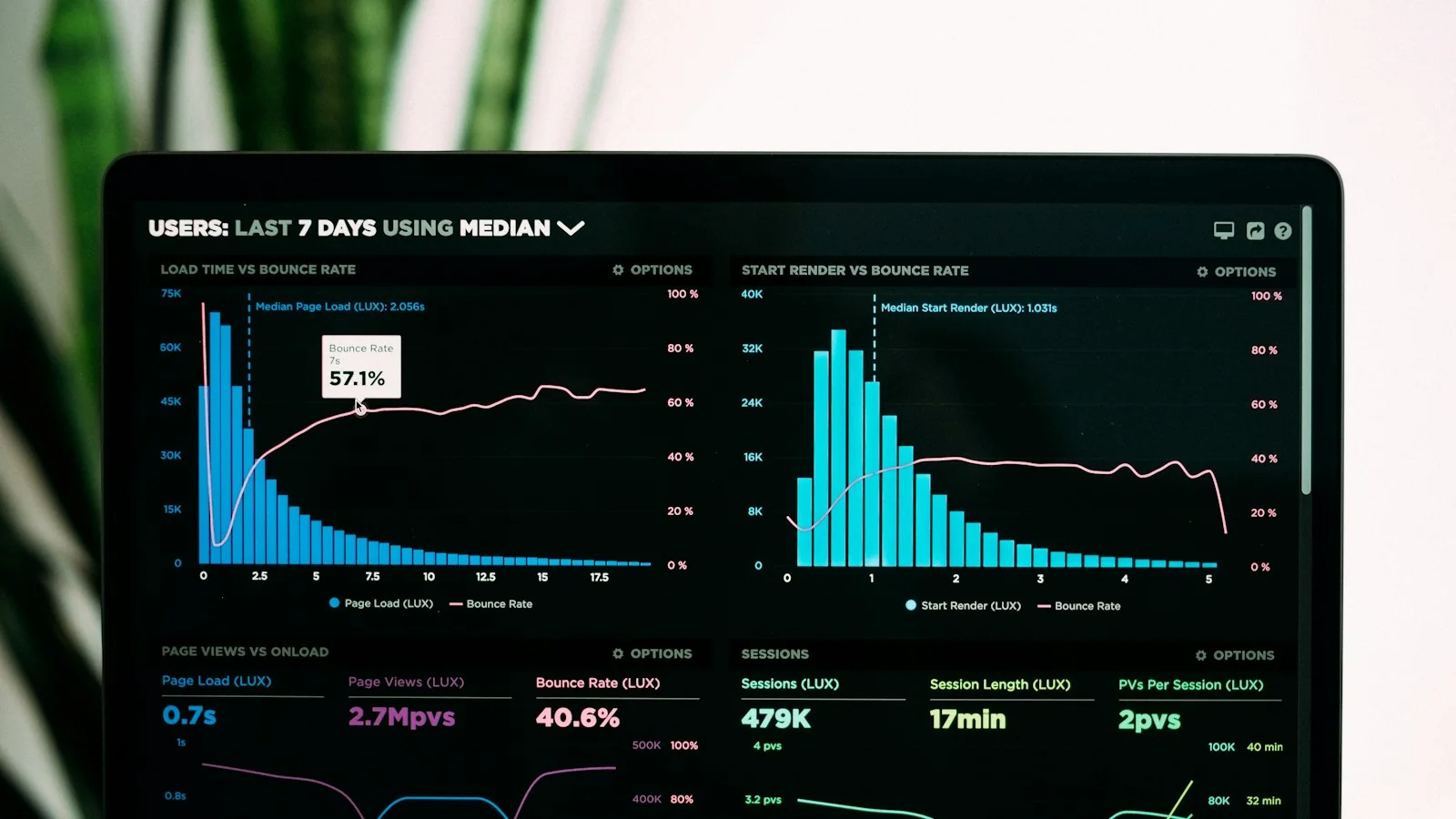
I pair these with evidence you already have - analytics paths, on-site search terms, support tickets - to see where current structure fails. Findings drive decisions; the aim is a structure users can navigate on first attempt, not one that looks tidy on a whiteboard.
Depth, breadth and the "click rules"
A common debate in IA is how many clicks something should take. Research is clear that the old "3-click rule" is not supported by data - users don't abandon tasks simply because they take more clicks, as long as each click feels like progress. What matters is information scent: labels that make the next step obvious.
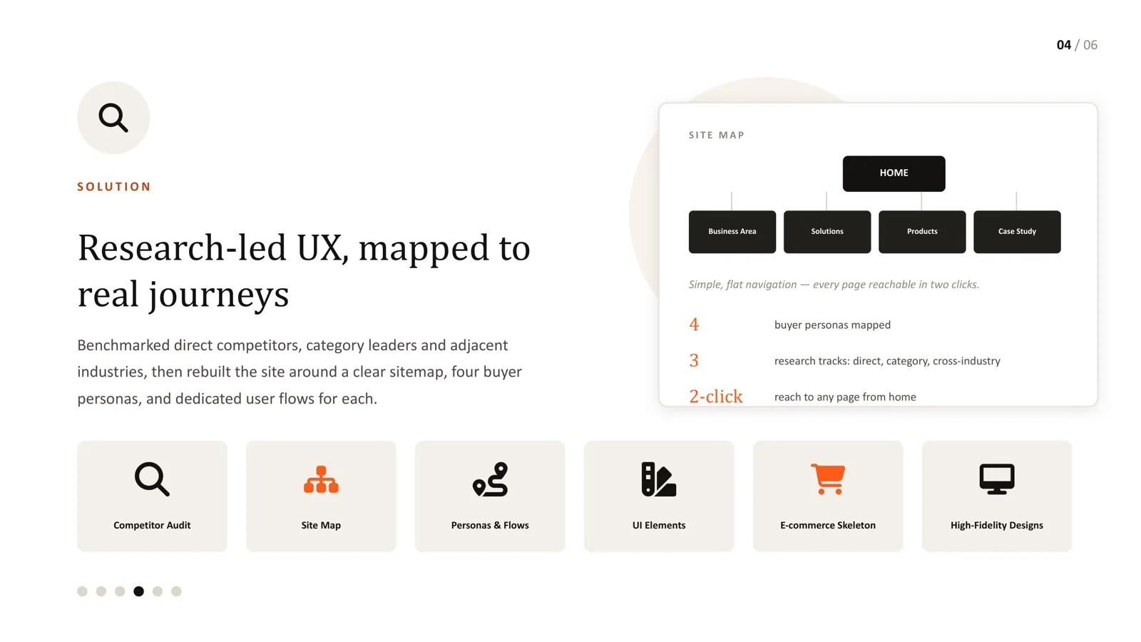
For large catalogs and complex products, I still find a practical target useful: every major section and category reachable in two confident decisions from the starting point. It pushes the structure towards breadth and makes you expose the second level directly - which is what improves scent. On a B2B hospitality equipment platform, a flat sitemap with a mega-menu put every page within two clicks of home for all three buyer types. Read the detail in information architecture for large B2B catalogs.
IA for data-heavy products
In SaaS and AI products, IA extends beyond navigation to how information is layered on each screen:
- What users need first to make their next decision.
- What they need sometimes, one step away.
- What belongs in settings, admin or audit areas.
Getting this layering right is what lets a data-heavy product feel focused. See UX/UI design for data-heavy AI interfaces for examples.