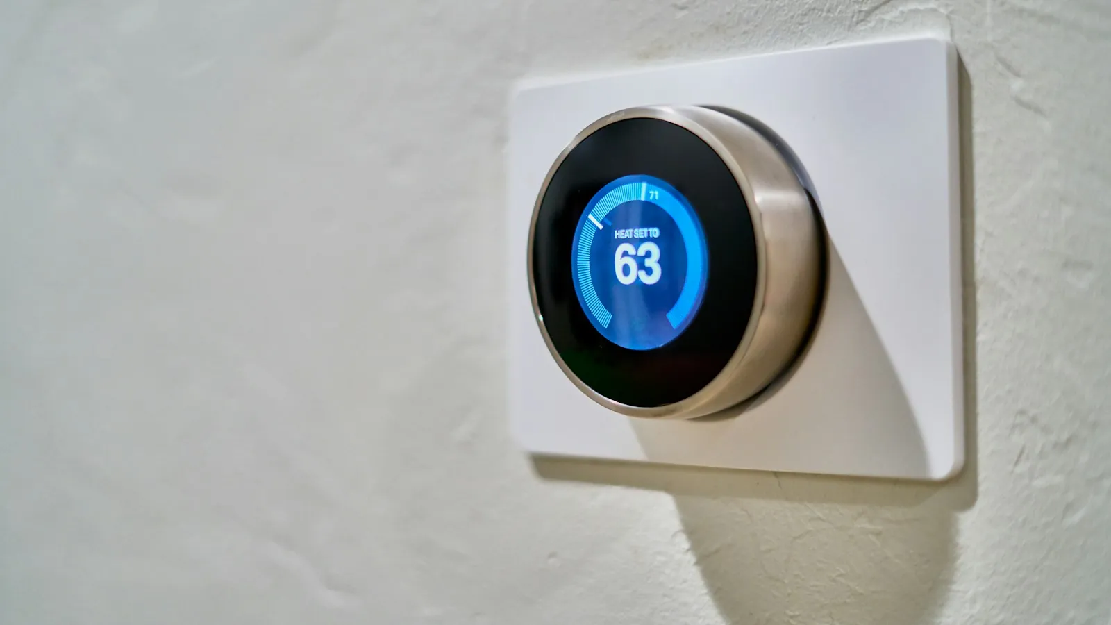
Close-up of a round smart thermostat dial on a wall
Home / Design Systems & Accessibility / Interaction patterns
Design Systems & Accessibility · Interaction patterns

Interaction patterns: solve recurring problems once, not every sprint

Components tell you what a button looks like. Patterns tell you how to build a form, a filterable table or an approval flow so it works the same way - and accessibly - everywhere in your product.

Forms & validationData tablesStatus & feedbackEmpty & error statesMicro-interactions

Components versus patterns

A component library answers "what does this piece look like?". An interaction pattern answers "how do we solve this recurring problem?" - combining components, behaviour, content and accessibility into a documented recipe.

For example, "text input" is a component. "Validating a long form and showing errors" is a pattern: when to validate (on blur, on submit), how errors appear, how they are announced to screen readers, where focus goes, what the summary looks like, and what happens to entered data. Without a documented pattern, every team makes these decisions again - and makes them differently.

This matters most in complex products, where the same problems recur constantly: forms, tables, filters, status, bulk actions, confirmations, loading and empty states. Consistency here is one of Nielsen's core usability heuristics: users should not have to wonder whether different situations or actions mean the same thing.

Is this you?

Signs you need documented patterns

01

Forms validate differently

Some on blur, some on submit, some not at all.

02

Tables behave inconsistently

Sorting, filtering and selection work differently in each module.

03

Status means different things

"Pending" is amber here, grey there, with different next steps.

04

Empty and error states are improvised

Blank screens, raw error codes or developer placeholders.

05

Confirmations are overused or missing

Trivial actions ask for confirmation; destructive ones don't.

06

Micro-interactions vary

Hover, loading and success feedback feel different across the product.

The patterns that matter most in complex products

PatternKey decisions it settles
Forms and validationField order, required vs optional, validation timing, inline and summary errors, preserving input
Data tablesSorting, filtering, pagination vs virtual scrolling, selection, bulk actions, density, column control
Search and filtersWhere filters live, applied-filter display, clearing, zero results, saving views
Status and progressFixed status vocabulary, colour + icon + text, next step, owner, timestamps
Empty statesFirst use, no results and cleared states - each with a helpful next action
ErrorsInline, page-level and system errors; wording; recovery; logging for support
Loading and waitingSkeletons vs spinners, progress for long tasks, partial results, cancellation
Confirmation and undoWhen to confirm, when to offer undo instead, wording that states consequences
NotificationsSeverity levels, persistence, stacking, where they appear, accessible announcements
NavigationGlobal and local navigation, breadcrumbs, tabs vs sub-pages, deep links

Status: one pattern, used everywhere

Status is the pattern I see break most often in B2B and healthcare products - and the one with the biggest trust impact. On a healthcare credentialing platform, credential states such as "Active" and "Verified" were defined once and communicated the same way across the product and beyond, so users could trust them without double-checking. The full approach is in UX design for credentialing workflows.

A status pattern defines:

  • A fixed vocabulary, with a definition for each state.
  • Colour, icon and text used together, never colour alone.
  • The next step and who owns it, for every non-final state.
  • Where status appears: lists, detail views, emails, exports.
  • How changes are announced, including to screen-reader users.

Accessibility built into patterns

Patterns are where accessibility is won or lost, because they involve behaviour, not just appearance:

  • Focus management - where focus goes when dialogs open and close, after errors and after deleting a row.
  • Announcements - status and error messages announced to assistive technology without stealing focus unnecessarily.
  • Keyboard support - tables, menus, tabs and custom widgets operable without a mouse.
  • Timing - warnings before timeouts, with a way to extend.
  • Motion - reduced-motion alternatives for animated feedback.

WebAIM's 2026 study found missing form labels on 51% of top home pages. A documented form pattern prevents that across every form a team builds.

The process

How I define patterns

  1. 01

    Find recurring problems

    Audit the product for the same problem solved in different ways.

  2. 02

    Study usage

    What users need, what breaks today and what the best current solution is.

  3. 03

    Design the pattern

    Behaviour, components, content and accessibility in one recipe.

  4. 04

    Test

    With users and with assistive technology for the complex ones.

  5. 05

    Document

    When to use it, how it works, examples and anti-patterns.

  6. 06

    Roll out

    Replace inconsistent implementations in priority order.

Predictable over clever

In enterprise and regulated products, predictable patterns beat clever ones. Novel gestures, hidden actions and unusual layouts make users learn something new, and every moment spent learning is attention taken from the real task. See UX/UI for enterprise applications in conservative industries.

What you get

01

Pattern library

Documented patterns for your product's recurring problems.

02

Behaviour specs

Interaction details, timing, focus and keyboard behaviour.

03

Content guidance

Wording for labels, errors, status and confirmations.

04

Accessibility notes

Announcements, focus management and testing guidance.

05

Examples and anti-patterns

From your own product, not generic references.

06

Rollout plan

Which existing implementations to replace first.

Frequently asked questions

How are patterns different from a component library?

Components are the parts; patterns are the recipes that combine parts, behaviour and content to solve a recurring problem consistently.

Which patterns should we define first?

The ones used most and causing the most inconsistency - usually forms, tables, status, errors and empty states.

Do patterns slow teams down?

The opposite. Teams stop re-debating the same decisions and build faster from a known recipe.

How do you test accessibility of patterns?

With keyboard-only testing, screen readers on the main platforms your users have, and automated checks - especially for tables, dialogs and custom widgets.

Can patterns cover AI-specific behaviour?

Yes. Streaming output, confidence, source attribution, feedback and human review are all recurring problems in AI products that benefit from documented patterns.

Sources

Every statistic in this page links to its original publisher. Figures were checked against these sources on September 29, 2026.

  1. 10 Usability Heuristics for User Interface Design - Jakob Nielsen, Nielsen Norman Group
  2. The WebAIM Million, 2026 report - WebAIM, 2026
Let's solve something

Same problem solved five different ways?

Let's document the patterns once so every team solves it the same way. Book a 30-minute call.

Book a 30-min call ↗