Overhead view of a designer's desk with wireframe stencils and a laptop
Home / Design Systems & Accessibility
Services · Design Systems & Accessibility

Design systems that make consistency and accessibility the default

I help product teams build and govern design systems - components, tokens, patterns and documentation - with WCAG accessibility built into every piece, so each new screen is consistent and accessible without extra effort.

Components & tokensInteraction patternsDocumentation & governanceAccessibility reviewsWCAG-informed design

Why design systems and accessibility belong together

A design system is the shared set of components, patterns, rules and documentation a product team builds from. Accessibility is the practice of making products usable by people with a wide range of abilities. They are usually treated as separate projects. They shouldn't be.

Most accessibility failures are created in a small number of places: colour choices, form components, interactive widgets, focus styles, and the way status and errors are communicated. Those are exactly the things a design system defines. If the system gets them right, every screen built from it inherits the fix. If it gets them wrong, every screen inherits the failure - and accessibility becomes an endless per-screen retrofit.

That is the core of how I work: accessibility built into the system's defaults, and a system governed well enough that it stays that way.

My experience here is hands-on. At Robosoft Technologies I led development and adoption of a customer-facing design system that improved reusability, and contributed to WCAG A/AA/AAA accessibility for a major banking client.

What's included

The five parts of the work

Engaged together or individually, depending on where your team is starting from.

01

Components & design tokens

Accessible components with every state, and tokens that keep design and code in sync. Explore components & tokens.

02

Interaction patterns

Documented solutions for recurring problems: forms, tables, navigation, status, errors, loading. Explore interaction patterns.

03

Documentation & governance

Usage guidance, ownership, contribution and change processes that keep the system alive. Explore documentation & governance.

04

Accessibility reviews

WCAG-based reviews of products and sites, with prioritised, practical fixes. Explore accessibility reviews.

05

WCAG-informed design

Accessibility decided during design - contrast, structure, focus, errors - not bolted on afterwards. Explore WCAG-informed design.

06

Adoption support

Rollout plans, training and migration help so teams actually use the system.

The case in numbers

34%faster task completion for designers with a design systemFigma
95.9%of the top million home pages have detectable WCAG failuresWebAIM, 2026
1 in 6people worldwide experience significant disabilityWHO, 2023

Design systems speed teams up: Figma's controlled study found designers with access to a design system completed their objective 34% faster. Accessibility, meanwhile, is still widely missed: WebAIM's 2026 analysis found detectable WCAG failures on 95.9% of the top million home pages, and the six most common error types - led by low-contrast text on 83.9% of pages - account for 96% of everything detected. Those six are almost all component and colour decisions: exactly what a design system controls.

Regulation is also tightening. US rules for state and local government and for HHS-funded organisations reference WCAG 2.1 Level AA, with deadlines now running to April 2027-2028 and May 2027-2028 respectively, and the European Accessibility Act has applied since 28 June 2025.

Where teams usually start

SituationTypical starting point
No system; inconsistent productAudit the UI, consolidate the most-used components, set up tokens and documentation
Component library but still driftingAdd usage documentation, states, governance and a contribution process
System exists; accessibility failingAccessibility review of core components and colours, then fix at system level
Procurement or regulation asking about accessibilityAccessibility review of key journeys, remediation plan, conformance documentation
Several products or brandsShared foundations and tokens with product-level themes
The process

How a design system engagement runs

  1. 01

    Audit

    Inventory UI patterns, colours and components across the product; run an accessibility baseline.

  2. 02

    Prioritise

    Pick the components and patterns used most, and the accessibility issues with the widest impact.

  3. 03

    Foundations

    Tokens for colour, type, spacing and more - with tested contrast for every text pairing.

  4. 04

    Components and patterns

    Built with every state and accessibility behaviour defined.

  5. 05

    Documentation

    Usage guidance, do/don't examples and accessibility notes for each piece.

  6. 06

    Governance

    Ownership, contribution, review and release processes.

  7. 07

    Adoption

    Migration plans, training and support for product teams.

What a good system includes

LayerContents
FoundationsColour tokens with roles and contrast values, type scale, spacing scale, grid, elevation, motion
ComponentsButtons, form controls, tables, navigation, dialogs, notifications, cards - with all states
PatternsForms and validation, data tables, status, empty and error states, onboarding, search and filters
ContentVoice, labels, error language, status vocabulary
AccessibilityKeyboard behaviour, focus management, screen-reader output, contrast, target sizes
GovernanceOwners, contribution path, changelog, deprecation, health metrics
Four-layer colour system from the AI enterprise brand ecosystem
From the work

A layered, WCAG-tested colour system for an AI enterprise

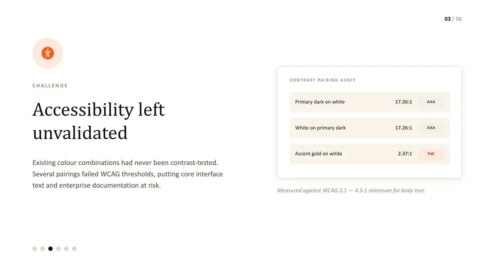
An AI-driven enterprise's colour system had never been formally tested. An accent pairing already in use measured 2.37:1 - under half the 4.5:1 minimum for body text.

  • Rebuilt as four layers: foundation, structural, interactive and utility.
  • Every pairing re-tested against WCAG 2.1; the primary pairing reached 17.26:1.
  • Governance rules so new pairings are tested before they ship.
Read the AI brand case study →

Frequently asked questions

Do we need a big team to maintain a design system?

No. Many effective systems start with one designer and one front-end engineer with protected time, plus a clear contribution process for product teams.

Should we build our own components or use a library?

A good open-source or commercial library can speed up engineering. You still need to define your tokens, states, patterns, accessibility behaviour and documentation on top of it.

Can you make an existing product accessible?

Yes. The most efficient route is usually to fix shared components and colours first, then work through critical journeys in priority order.

Which accessibility standard should we target?

WCAG 2.1 Level AA is the common baseline and the level most current regulations reference. Designing to WCAG 2.2 AA gives some margin. Confirm legal obligations with your advisers.

How do we measure whether the system is working?

Adoption across screens, fewer hard-coded values and detached components, faster delivery of standard screens, and fewer accessibility defects traced to custom UI.

Sources

Every statistic in this page links to its original publisher. Figures were checked against these sources on September 29, 2026.

  1. Measuring the value of design systems - Figma
  2. The WebAIM Million, 2026 report - WebAIM, 2026
  3. Disability and health fact sheet - World Health Organization, 2023
  4. Fact sheet: new rule on the accessibility of web content and mobile apps - US Department of Justice, ADA.gov
  5. Compliance with Section 504 of the Rehabilitation Act - Alston & Bird, updated May 2026
  6. European Accessibility Act - European Commission
Let's solve something

Product drifting - or failing accessibility checks?

Book a 30-minute intro call or send a message. We'll look at where consistency and accessibility break, and what a system would fix.

Book a 30-min call ↗