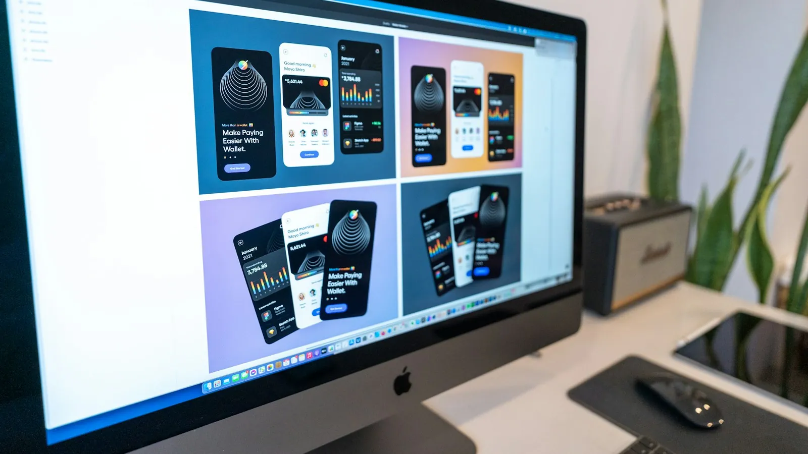
Monitor displaying several mobile app interface designs
Home / UX/UI & Product Design / Interface design
UX/UI & Product Design · Interface design

Interface design where every state is designed, not left to chance

High-fidelity screens, components and states for complex products - consistent across the product, accessible by default and specified in enough detail that engineering builds exactly what was designed.

High-fidelity UIComponent statesData-dense layoutsAccessibilityDev handoff

Interface design is where decisions meet users

Everything upstream - research, information architecture, flows, prototypes - eventually becomes a screen someone uses. Interface design is the work of making those screens clear, consistent, accessible and buildable: choosing layouts, components, hierarchy, words and every state a screen can be in.

In complex products, the difference between a good and a mediocre interface is rarely in the headline screens. It is in the details that get skipped: the empty state, the loading state, the error message, the table with 400 rows, the long name that breaks the layout, the disabled button that doesn't say why.
Is this you?

Signs your interface needs attention

01

Screens look different across the product

Different teams have built different patterns for the same job.

02

States are missing

Empty, loading and error states show raw data, spinners or developer text.

03

Tables and dashboards overwhelm

Everything has equal weight, so nothing stands out.

04

Accessibility complaints or audit findings

Contrast, focus and labels weren't designed in.

05

Engineering asks lots of questions

Designs don't specify enough, so developers guess.

06

The product doesn't match the brand

Marketing looks premium; the app looks unfinished.

What I design

AreaWhat it includes
Layout and hierarchyGrids, spacing, visual priority, responsive behaviour across breakpoints
ComponentsButtons, forms, tables, cards, navigation, dialogs, notifications - built on or feeding a design system
StatesDefault, hover, focus, active, disabled, loading, empty, error, partial, success, read-only
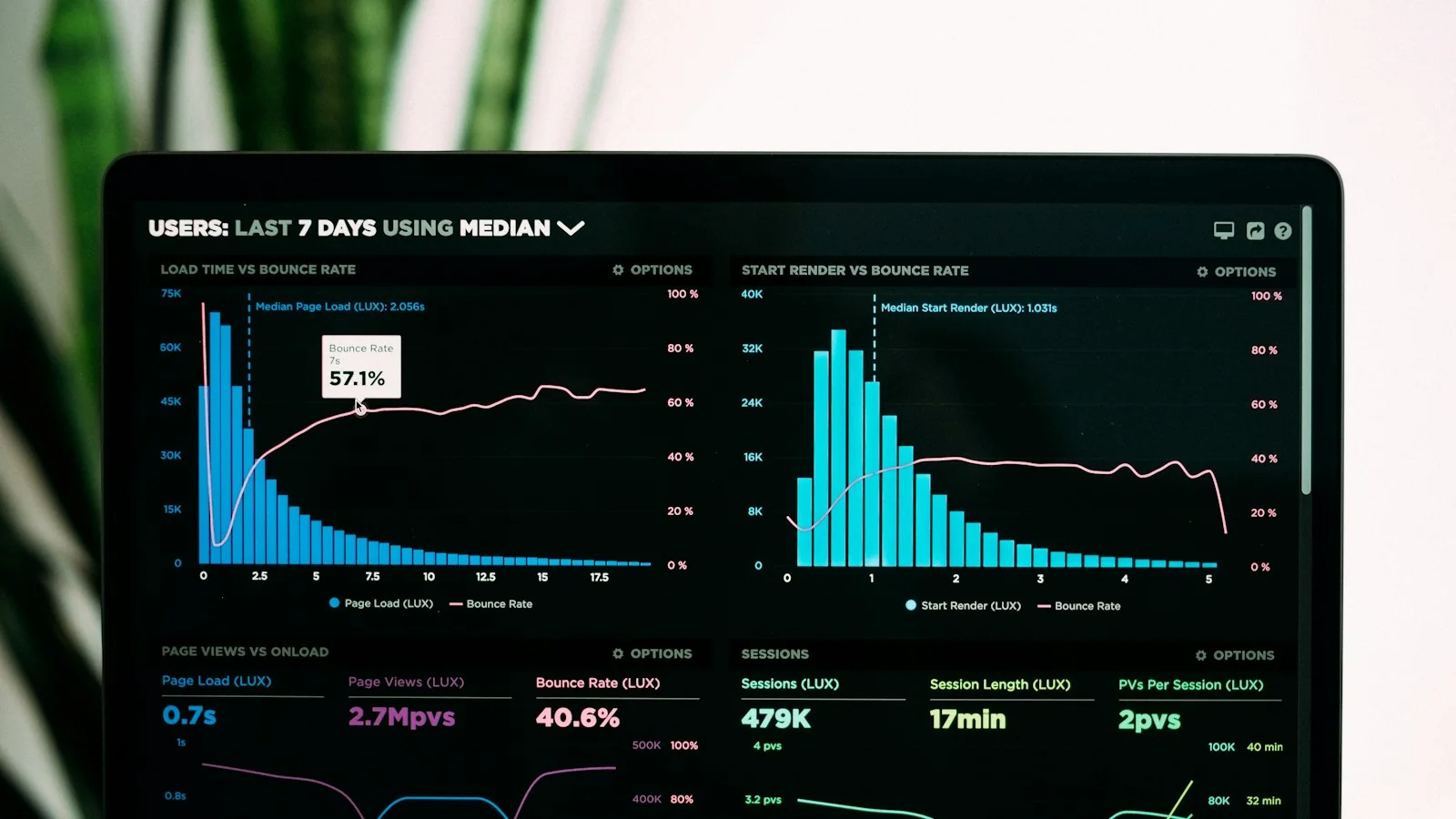
Data displayTables, charts, dashboards and detail views that stay readable at high density
ContentLabels, microcopy, errors and status language, written with the interface
AccessibilityContrast, focus visibility, target sizes, semantic structure and error handling
SpecificationMeasurements, tokens, interaction notes and edge cases for engineering

Designing for dense, data-heavy products

Many of the products I design - enterprise SaaS, AI tools, healthcare operations platforms - are data-heavy. Density is not the enemy; disorder is. Principles I apply:

  • Lead with what needs attention - exceptions, changes and actions before routine data.
  • Summary first, detail on demand - progressive disclosure rather than cramming.
  • One accent colour for action - so users learn what is clickable; status uses its own tested colours with text and icons.
  • Disciplined tables - sticky headers, aligned numbers, units in headers, sensible default sorting, density options.
  • Honest trust signals in AI products - sources, confidence and edit controls. See UX/UI design for data-heavy AI interfaces.

Accessibility is part of the interface, not an audit

Interfaces are where most accessibility failures are created - and where they are cheapest to prevent. WebAIM's 2026 analysis of the top million home pages found low-contrast text on 83.9% of them and missing form labels on 51%. Every interface I design meets WCAG 2.1 AA contrast for text, includes visible focus states and labelled form fields, and never relies on colour alone for meaning. For the method, see WCAG contrast testing for AI product UIs.

83.9%of top home pages have low-contrast textWebAIM, 2026
51%have missing form input labelsWebAIM, 2026
4.5:1minimum text contrast at WCAG AAW3C

Consistency: design once, use everywhere

Interface design is most efficient when it builds a system as it goes. Each new component is designed with its states and rules so it can be reused, rather than redrawn per screen. Figma's research found designers with a design system completed a task 34% faster than without one - and engineers benefit in the same way. On products without a design system, I start one; on products with one, I work within it and extend it properly. See design systems & accessibility.

The process

How I approach interface design

  1. 01

    Start from tested structure

    Flows and wireframes agreed and, where it matters, tested with users.

  2. 02

    Establish the visual language

    Or apply the existing brand and design system to the product context.

  3. 03

    Design key screens

    The screens that carry the most important tasks, at every breakpoint.

  4. 04

    Design every state

    Empty, loading, error, partial, success and edge cases with realistic content.

  5. 05

    Review with engineering

    Feasibility, performance and component reuse before sign-off.

  6. 06

    Specify and support

    Detailed handoff and design QA during build. See design handoff.

What you get

01

High-fidelity screens

Key screens across breakpoints, with realistic data.

02

Component specs

Every component with its states, variants and behaviour.

03

State library

Empty, loading, error and success patterns ready to reuse.

04

Accessibility notes

Contrast values, focus order, labels and keyboard behaviour.

05

Design tokens

Colour, type and spacing values mapped to your codebase where possible.

06

Design QA

Review of the built product against the design, with a fix list.

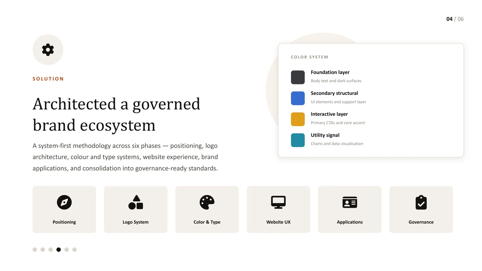
Website UX applying the AI enterprise brand system
From the work

Brand and interface as one system for an AI enterprise

For an AI-driven enterprise, the brand system was applied to real product and marketing surfaces, not just a brand deck.

  • A four-layer colour system - foundation, structural, interactive and utility - tested against WCAG 2.1.
  • The primary pairing reached 17.26:1, fixing an accent pairing that had measured 2.37:1.
  • A consistent UI language across website UX and applications.
Read the AI brand case study →

Frequently asked questions

Can you design within our existing design system?

Yes. I work within existing systems and propose additions through your contribution process when a genuinely new pattern is needed.

Do you design both web and mobile interfaces?

Yes - responsive web applications and mobile flows, deciding which tasks belong on which device based on real usage.

How detailed are your handoff files?

Detailed enough that engineers rarely need to guess: measurements, tokens, states, interactions, content rules and accessibility notes, organised in Figma.

Do you check the build against the design?

Yes. Design QA during implementation catches drift early, when it is cheap to fix.

Can you improve the UI without changing the whole product?

Often the best approach. Improving shared components, states and the highest-traffic screens delivers much of the value with less disruption.

Sources

Every statistic in this page links to its original publisher. Figures were checked against these sources on September 29, 2026.

  1. The WebAIM Million, 2026 report - WebAIM, 2026
  2. Understanding SC 1.4.3: Contrast (Minimum) - W3C
  3. Measuring the value of design systems - Figma
Let's solve something

Interface looking polished but still confusing?

Let's design the parts users actually struggle with. Book a 30-minute call.

Book a 30-min call ↗